filmov
tv
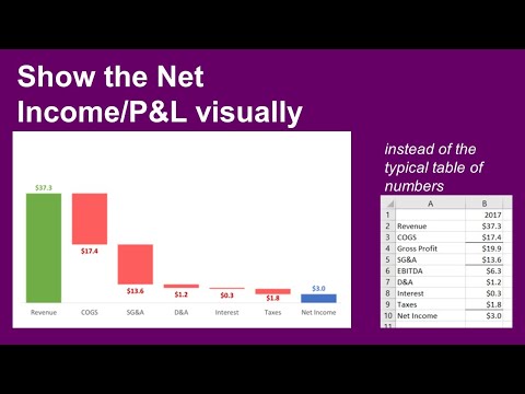
Presenting Income/P&L statement: Show how revenue less expenses results in net income

Показать описание
Today you will learn a great visual to use when presenting the Net Income from the Income or Profit & Loss Statement.
Too often Income or P&L presentations to executives or the Board are filled with spreadsheets. In my surveys of audiences they tell me that large tables of numbers are confusing and overwhelming. Our audiences want meaningful visuals instead of confusing spreadsheets.
You already have the tool you need to create these visuals, Excel. That’s right, the Excel you’ve used for years is all you need to create a graph that visually shows the income and each expense area resulting in the net income. I call it a steps to a total graph and you’ll see what it looks like, how to set up the data for the graph and tips on creating the graph in Excel.
The graph you’ll see allows the executives or Board to quickly see which expense areas are the largest, and how the expenses compare to the income.
And don’t worry, I won’t suggest you need to learn VBA programming or buy some add-in that your IT department won’t allow you to install on your corporate laptop. Everything you see is done in plain vanilla Excel.
 0:05:24
Presenting Income/P&L statement: Show how revenue less expenses results in net income
 0:09:30
Breaking Down the P&L with Kevin Cope | Breaking down the Income Statement
 0:06:07
Presenting Income/P&L statement: Show Budget and variance walk of expense categories
 0:11:26
The INCOME STATEMENT Explained (Profit & Loss / P&L)
 0:11:24
How to Analyze an Income Statement Like a Hedge Fund Analyst
 0:16:17
P&L STATEMENT Explained (Profit and Loss or Income Statement)
 0:10:17
The 3 Financial Statements: Income Statement (P&L), Cash Flow Statement, and Balance Sheet
 0:14:26
How To Forecast Income Statements (P&Ls) in Excel Fast
 0:10:06
Understanding the Income Statement - Every small business owner needs to know this!
 0:17:50
How To Analyze an Income Statement
 0:04:35
Represent Income Statement through Waterfall Chart in Excel
 0:11:33
How to Read Company Financial Statements (Basics Explained)
 0:20:21
The Income Statement Explained! (Learn the P&L Basics)
 0:27:45
Power BI: The Income Statement
 0:12:19
Connecting the Income Statement, Balance Sheet, and Cash Flow Statement
 0:10:08
How to Read the Profit & Loss Statement | P&L Statement explained in Hindi
 0:17:38
Income Statement Lecture: How To Read A Profit & Loss Statement
 0:01:00
How to Read an Income Statement #shorts
 1:01:22
Financial Dashboard - Income Statement In Power BI
 0:17:20
How to Fake an Income Statement in Power BI
 0:00:58
How to Visualize Income Statement
 0:15:16
How To Find Mistakes In The Income Statement
 0:15:54
How To Create Month End Close Checklist. Start With The Financial Statements Line Items!
 0:13:04
PROFIT & LOSS Statement Explained | Income Statement Analysis | Finance for Entrepreneurs #start...
Комментарии