filmov
tv
Power BI Python Seaborn || pairplot || Custom Visuals in Power BI 4
Показать описание
#powerbi #python #seaborn
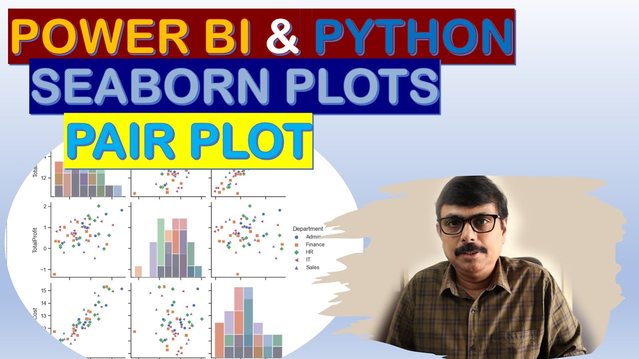
A pairplot plot a pairwise relationships in a dataset. The pairplot function creates a grid of Axes such that each variable in data will by shared in the y-axis across a single row and in the x-axis across a single column.
The basic layout of pairplot creates a set of plots in diagonal and off diagonal with histogram and scatterplot respectively.
Histogram takes care of Distribution of Data and Scatterplot shows the relationship. You can also use reg , kde etc to make this visual more readable.
#howtocreatepariplot
 0:13:49
Power BI || Python || Seaborn || strip plot || Custom Visuals in Power BI 3
 0:07:39
Seaborn (Python) in Power BI: Pairplot
 0:08:33
Power BI Python Seaborn || pairplot || Custom Visuals in Power BI 4
 0:00:16
Python and power bi integration using Seaborn
 0:00:59
Easily import sample Power BI data using Python & Seaborn
 0:08:08
Power BI || Python || Seaborn || relplot || Custom Visuals in Power BI 2 ||
 0:00:35
Microsoft Power BI and Python Seaborn Swarmplot Soccer Analytics
 0:07:16
Intro to Python in Power BI
 0:01:00
How to Become A Data Analyst: Master Storytelling With Data Using Tableau, Power Bi, Excel, Sql
 0:09:46
Power BI || Python || Seaborn || Heatmap || Custom Visuals in Power BI 1
 0:03:55
Create a regplot with Seaborn Power BI
 0:00:09
The Power of Seaborn Python Library to Create Data Visualizations!
 0:16:27
How To Create 3D Scatter Plots In Power BI Using Python
 0:11:32
How to do a pairplot in Power BI using Python
 0:16:00
How to create a CORRELATION MATRIX in Power BI using the Python Visual
 0:03:37
Create a stripplot with Seaborn Power BI
 0:18:09
Python in Power Bi, part 3 : Hexbin plot with Matplotlib & Seaborn libraries
 0:02:49
Create a lmplot with Seaborn Power BI
 0:37:27
Power BI and Python Machine Learning A to Z Part 5: Visual Analysis with Power BI and Python Visuals
 0:05:55
Use Python to Create a Correlation Heatmap Visual in Power BI
 0:03:27
Create a boxplot with Seaborn Power BI
 0:15:46
How to Visualize Data in Python Using Seaborn | Seaborn Tutorial.
 0:05:11
Power BI with python || relplot (scatter plot with HUE) || seaborn - part 3
 0:01:04
I Create Dashboard in One Minute using Python | Python for beginners | #python #coding #programming
Комментарии