filmov
tv
How To Create 3D Scatter Plots In Power BI Using Python

Показать описание
3D scatter plots are mainly used to plot data points in three axes with the objective of showing the relationship between three variables. In this video, Gaelim is going to demonstrate how you can make a 3D scatter plot on Power BI using Python code.
***** Video Details *****
00:00 Introduction
00:44 Data set
01:03 Importing packages
02:06 Loading seaborn data set
02:45 Dimensions & metrics
03:05 Setting x, y, z variables
03:38 Creating a figure
05:44 Creating plots
08:00 Setting axes names
09:09 Interactivity
10:10 Altering viewpoint
11:10 Bringing into Power BI
***** Learning Power BI? *****
#EnterpriseDNA #Python #PythonTutorial #PowerBI #PowerBIDesktop #PowerBITutorial
 0:01:40
how to create a 3D scatter plot using Python Plotly
 0:08:49
XYZ Mesh v9 Tutorials part 2 - XYZ to 3D Scatter in Excel and 3D Mesh in Excel
 0:16:27
How To Create 3D Scatter Plots In Power BI Using Python
 0:00:08
how to make 3D scatter-plots for free
 0:04:40
How to make a 3D scatter plot in Origin Pro 2024 | Complete Tutorial
 0:09:44
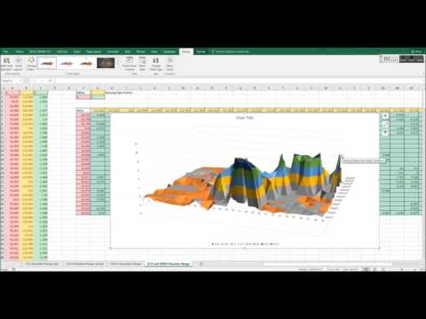
Graph X Y Z Data Inside Microsoft Excel in 3D - 3D Scatter, 3D Surface, XYZ Mesh
 0:08:02
How to Create 3D Scatter Graphs using Python
 0:00:38
Corona road lines material using Distance map
 11:54:59
RStudio R programming session 192
 0:17:24
Professional 3D Plotting in Matplotlib
 0:00:34
Blender.Tip: Create Scattered Objects. #3d ##3danimation #blender3d #blender #games #satisfying
 0:00:54
How To Make 3D Scatterplot In Python | Python Tutorial
 0:00:15
How I create 3d Screen Tutorial in Capcut 🗿🔥 #capcut #tutorial #edit
 0:06:23
X Y Z into 3D Surface Graph in Microsoft Excel with XYZ Mesh v4
 0:09:05
How to Create 3D Scatter Plot in NCSS | Biostatistics | Statistics Bio7
 0:00:48
Create a 3D Scatter Plot in Python | Matplotlib & NumPy Tutorial
 0:04:57
3D Scatter Plot Python
 0:04:51
Make 3D XYZ Graphs Inside Excel - Surface, Scatter and Line graphs using XYZ Mesh Software
 0:00:12
how to make 3D scatter-plots for free
 0:07:46
How to create a multivariable 3D scatter plot in NCSS | Biostatistics | Statistics Bio7
 0:02:00
How to Create Interactive 3D Scatter Plots using Python (in 2 minutes)
 0:14:55
3D Scatter plot|Python|How to plot 3D Scatter/Line plot in Python? |For Beginners| #python
 0:05:59
How to use Scatter in 3DS Max 2023 #tutorial #lesson #3dsmax #3d #2023 #scatter
 0:03:09
R Programming Create Scatter Plot 3D
Комментарии