filmov
tv
Getting Started with the Angular Stepper Component

Показать описание
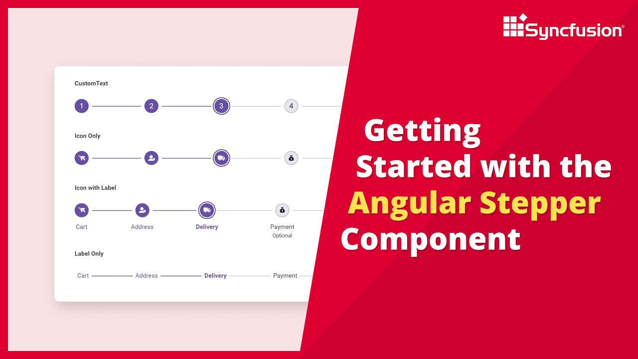
Learn how to add the Syncfusion Angular Stepper component to an Angular application. This video demonstrates how to create an Angular app and add the Syncfusion Angular Stepper component to it. You will learn how to create a simple progress flow indicator on an e-commerce checkout page by adding steps, labeling them, and adding icons to them.
The Syncfusion Angular Stepper is a highly customizable component that lets users navigate through a series of steps in a process within a web application. It displays a list of steps, highlighting the current step.
The Stepper supports different step types, orientations, linear flows, label positions, and template customization. It also supports tooltips to show additional information when users hover over a step, such as a label or text. Tooltips can be customized using templates to provide more detailed information.
You can set the validation state for each step to display a success or error icon. The Stepper component supports these built-in themes: Tailwind CSS, Bootstrap 5, Bootstrap 4, Bootstrap, Material, Fabric, Fluent, and high contrast. Users can customize any of these or create a new theme to achieve their desired look and feel by overriding SASS variables or using our Theme Studio application.
TRIAL LICENSE KEY
-----------------
If you need a trial license key, start your Angular trial from your Syncfusion account and then obtain your trial license key from the downloads page:
Check your eligibility for a free license for all Essential Studio products on our Community License page.
BOOKMARK DETAILS
-------------------
[00:00] Introduction
[00:29] Create an Angular app
[01:25] Add the Angular Stepper component
[03:49] Add icons
ANGULAR STEPPER
---------------------
SUBSCRIBE
---------
SOCIAL COMMUNITIES
-------------------
#angular #navigation #stepper
Комментарии
 0:02:19
 0:06:36
 17:33:53
 0:20:46
 0:02:00
 0:11:49
 0:05:07
 2:02:42
 0:00:22
 0:11:03
 3:43:28
 0:07:47
 0:09:15
 0:06:20
 0:12:18
 0:19:48
 0:15:17
 5:39:32
 0:08:02
 0:58:49
 0:11:07
 0:04:15
 0:09:53
 0:24:18