filmov
tv
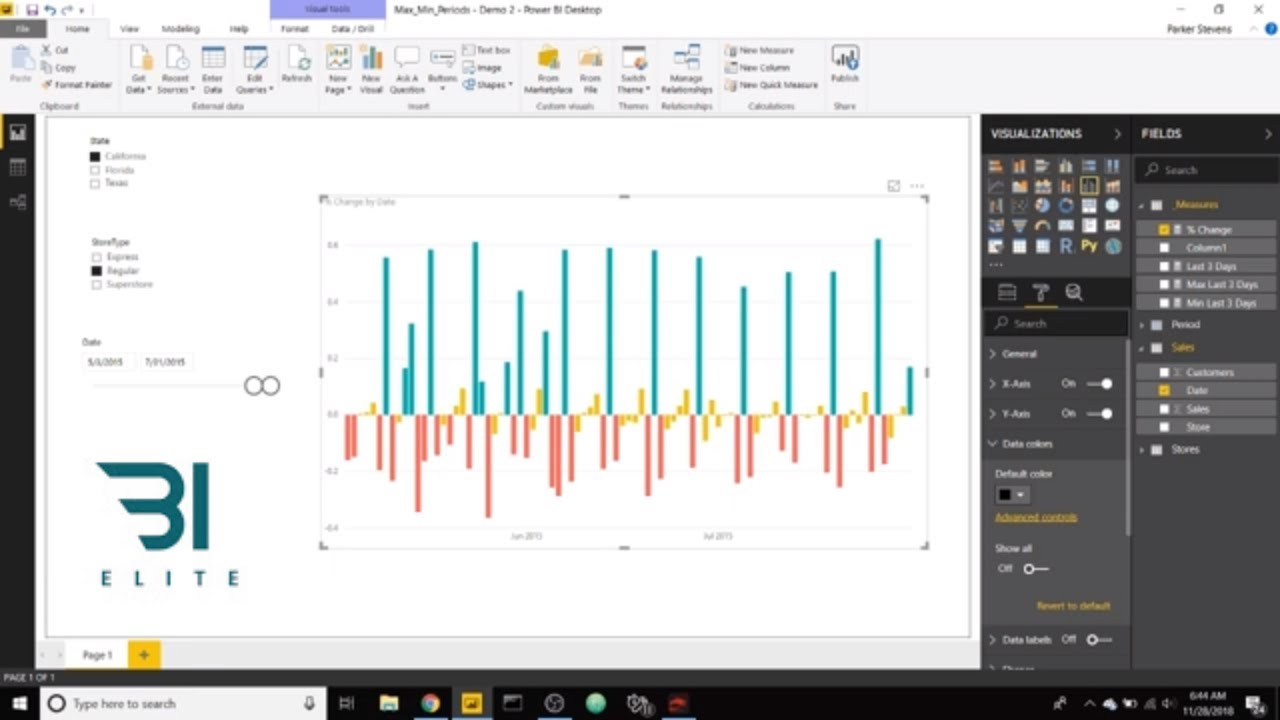
Power BI - Highlighting Positive and Negative Values in a Bar Chart

Показать описание
Hey guys! Parker here. Here's a quick Power BI tutorial on how to show positive bars as green and negative bars as red in a bar chart. This uses the same conditional formatting functionality as we've seen in the past. It only takes a second to set up, so let's get started!
Enroll in my introductory or advanced Power BI courses:
Elite Power BI Consulting:
Data Insights Tools:
Connect with me on Twitter!
Enroll in my introductory or advanced Power BI courses:
Elite Power BI Consulting:
Data Insights Tools:
Connect with me on Twitter!
Power BI - Highlighting Positive and Negative Values in a Bar Chart
Highlight Positve and Negative Values in Power BI
How do you conditionally highlight a bar in a Power BI Report?
Highlighting Line Chart Markers in Power Bi
How to use Conditional Formatting in Power BI | Microsoft Power BI for Beginners
Conditionally Formatting Positive & Negative Line Chart Colors in Power BI
Power BI : Elevate Your Charts with Tips for Displaying Total on Top and Bottom for Negative Profit
Conditional format a line chart in Power BI
Ola Taxi Rides Analysis Dashboard in Power BI
Should You Learn Power Bi? Everything You Need To Know
Salary Of Power BI Developer | Power BI Salary In India #Shorts #simplilearn
How to HIGHLIGHT LEGENDS in your LINE CHARTS NO DAX REQUIRED // Beginners Guide to Power BI in 2023
Highlight Current Month in the Line Chart | Power BI
Conditional Formatting for Stacked/Clustered Column Chart in Power BI | New Power BI feature
Why Using Good Colours Across Your Reports Is Essential In Power BI
How to Make a Graph Change Color Based on Value | Conditionally Formatting Charts
Power BI - Highlighting the Current User's Data
DAX for Power BI - Highlight Current Period
How to create Custom KPI Card in PowerBI | MI Tutorials
Conditional Format a Table/Matrix in PowerBI | PowerBI Tutorial
POWER BI Dashboard vs Report
Make this Creative & Insightful Line Chart in Power BI 📈
Power BI Report design Tips and Tricks
Dynamically Highlight Line Chart Series in Power BI
Комментарии
 0:02:14
 0:05:33
 0:07:07
 0:01:12
 0:09:53
 0:03:32
 0:01:09
 0:00:39
 0:45:20
 0:09:07
 0:00:49
 0:09:09
 0:15:00
 0:03:15
 0:14:42
 0:01:31
 0:07:12
 0:05:41
 0:05:40
 0:07:13
 0:04:00
 0:14:52
 0:43:43
 0:08:45