filmov
tv
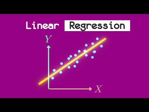
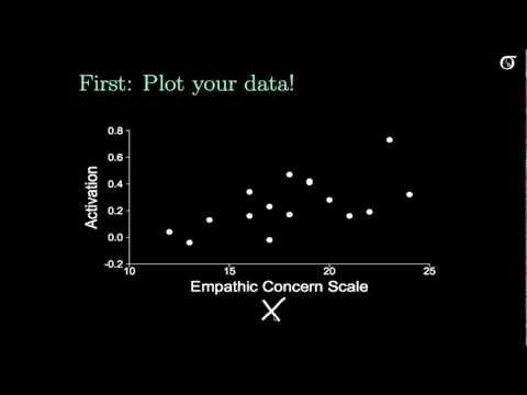
Simple Linear Regression: Always Plot Your Data!

Показать описание
A quick look at a few cautions about simple linear regression.
Anscombe's quartet can be found in:
Anscombe, F. (1973). Graphs in statistical analysis. American Statistician, 27:17--21.
The fuel use vs speed data is found in:
West, B.H., McGill,R.N., Hodgson, J.W., Sluder, S.S. , and Smith D.E., Development and Verification of Light-Duty Modal Emissions and Fuel Consumption Values for Traffic Mod- els, FHWA-RD-99-068, U.S. Department of Transportation, Federal Highway Administration, Washington, DC, March 1999.
The life expectancy vs television data is a random sample from the 2008 Economist Pocket World in Figures.
 0:05:25
Simple Linear Regression: Always Plot Your Data!
 0:08:04
Simple Linear Regression: Checking Assumptions with Residual Plots
 0:02:34
Linear Regression in 2 minutes
 0:13:29
Video 1: Introduction to Simple Linear Regression
 0:03:05
Simple Linear Regression: Assumptions
 0:07:14
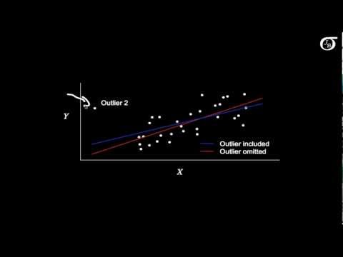
Leverage and Influential Points in Simple Linear Regression
 0:06:03
Simple Linear Regression: Checking Assumptions with Residual Plots (Old, fast version)
 0:09:08
Conducting a Simple Linear Regression in SPSS with Assumption Testing
 11:54:58
Discovering statistics using R full course part 51
 0:07:27
Simple Linear Regression: Transformations
 0:05:18
An Introduction to Linear Regression Analysis
 0:05:42
Introduction to Simple Linear Regression (Old, fast version)
 0:05:05
Simple Linear Regression: Interpreting Model Parameters
 0:09:40
Introduction to Simple Linear Regression
 0:07:39
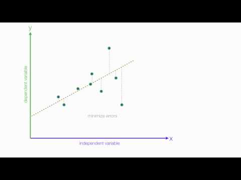
Introduction to residuals and least squares regression
 0:15:31
simple linear regression in 8 steps (part 1 - in spss)
 0:14:51
How To Perform Simple Linear Regression In Excel
 0:19:39
Simple Linear Regression
 0:27:27
Linear Regression, Clearly Explained!!!
 0:10:33
Assumptions of Linear Regression
 0:19:22
Simple Linear Regression [see description]
 0:10:05
Linear Regression Summary in R
 0:23:40
Week 10 : TUTORIAL: SIMPLE LINEAR REGRESSION
 0:22:52
Intuition Behind Simple Linear Regression - Part-1
Комментарии