filmov
tv
How to Make a Presentation Deck that Doesn't Stink | Christine vs. Work

Показать описание
I’m staring at a blank slide deck in agony. Now what?
Making slide deck presentations (you know, Powerpoint and the like) is a common task on the job—but how do you deliver a slideshow that really blows people away? If you’re not a graphic designer or a superstar at presentation software, what’s the best way to approach building a deck? And how do you succeed at putting on a good show?
In this episode, Christine speaks with Dan Zedek, professor of journalism and media innovation at Northeastern University and design professional, about how to write and design a presentation with energy and impact.
00:00 Is making a slide deck painful for you, too?
01:35 Let's talk about that first blank slide.
02:20 What are the common mistakes?
02:43 How long should a single slide last?
03:28 How much personality be in my presentation?
04:02 How does the audience change how I design my slides?
04:45 Ok, where do I really start?
05:35 Teach me how to be a designer, please.
07:33 A Slide Deck About Slide Decks
#presentations #slidedeck #powerpoint
Follow us:
 0:00:59
How to create a presentation in PowerPoint
 0:14:35
The 3 Magic Ingredients of Amazing Presentations | Phil WAKNELL | TEDxSaclay
 0:07:36
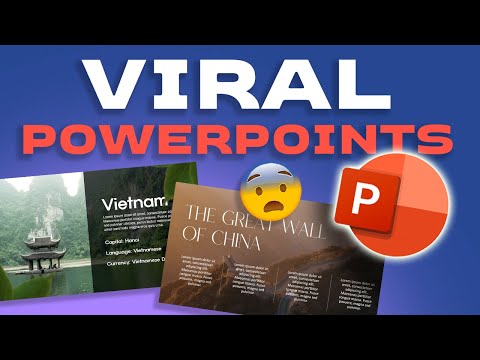
How I created these VIRAL POWERPOINTS 🥵🥵🥵
 0:03:28
How to start a presentation
 0:00:46
Dynamic slides in PowerPoint using MORPH 😱 #tutorial #presentation #shorts
 0:07:04
HOW TO Give a Great Presentation - 7 Presentation Skills and Tips to Leave an Impression
 0:20:28
PowerPoint Tutorial for Beginners
 0:05:48
2 Genius Ways To Use ChatGPT To Create A PowerPoint Presentation
 0:07:16
How to Make PowerPoint Presentation Using AI| Generate Presentation in 10 seconds| Gamma 2024 @DESH✅...
 0:07:34
How to Do a Presentation - 5 Steps to a Killer Opener
 0:09:51
How to make great presentations | 10 powerful presentation tips
 0:00:37
Would you do this in a presentation? 😂
 0:00:28
Make PPT in just 2 minutes ‼️🤩
 0:05:36
How to Create a Powerpoint Presentation | a Beginner's Guide
 0:16:46
Presentations in English - How to Give a Presentation - Business English
 0:20:44
PowerPoint for Beginners | Step by Step Tutorial to get started
 0:20:46
How to Create a Presentation on Canva in 20 Minutes
 0:08:02
How to make an interactive PowerPoint presentation - PowerPoint basic training
 0:05:13
Good Presentation VS Bad Presentation *
 0:03:48
How To Create Professional PowerPoint Presentation Slides - Best PowerPoint Presentation
 0:00:46
How to Start a Speech THE RIGHT WAY #shorts
 0:09:55
Presentation Tutorial: How To Make a Presentation in Canva (FREE & EASY)
 0:04:18
How to Start your Presentation: 4 Step Formula for a Killer Intro
 0:00:55
Dynamic AGENDA slides in PowerPoint 😍 #presentation
Комментарии