filmov
tv
Bad typography has ruined more than just the Oscars

Показать описание
How bad graphic design changed award shows, elections, and your medicine cabinet.
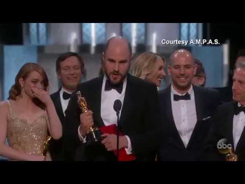
The 2017 Oscars ended with a pretty shocking mix-up. Announcer Warren Beatty incorrectly named La La Land as the Best Picture winner, and the mistake wasn't revealed until crew members had already started giving their acceptance speeches. A lot of things went wrong for the snafu to happen the way it did. But what if typography was one of them? A better announcement card design could have made for a very different Academy Awards show — not to mention a much less embarrassing Miss Universe show for Steve Harvey back in 2015. But the implications of bad typography don't end there: poorly designed ballots in the 2000 presidential election arguably could have swayed the outcome, and illegible type on medicine bottles could be causing nearly 500,000 cases of drug misuse per year in the U.S.
The 2017 Oscars ended with a pretty shocking mix-up. Announcer Warren Beatty incorrectly named La La Land as the Best Picture winner, and the mistake wasn't revealed until crew members had already started giving their acceptance speeches. A lot of things went wrong for the snafu to happen the way it did. But what if typography was one of them? A better announcement card design could have made for a very different Academy Awards show — not to mention a much less embarrassing Miss Universe show for Steve Harvey back in 2015. But the implications of bad typography don't end there: poorly designed ballots in the 2000 presidential election arguably could have swayed the outcome, and illegible type on medicine bottles could be causing nearly 500,000 cases of drug misuse per year in the U.S.
 0:05:59
Bad typography has ruined more than just the Oscars
 0:02:00
Bad typography has ruined more than the Oscars
 0:03:28
Bad typography has ruined more than the Oscars
 0:07:16
'Moonlight' or 'La La Land'? Best Picture Mix-up at Oscars
 0:02:55
when the fonts bring down an s-tier film
 0:00:13
GUESS HOW LONG THIS TOOK ME😫
 0:07:05
Did Canva Just Destroy The World Of Graphic Design FOREVER!?
 0:03:52
How one typeface took over movie posters
 0:07:33
Why do we accept bad design? | Paul Rowan | TEDxToronto
 0:00:47
Photos that I thought were fake but they are not #Kpop #Shorts
 0:10:43
Why we all need subtitles now
 0:03:53
The chart that predicts recessions
 0:13:10
I Designed with the World's Most HATED Fonts (Reddit Seethed)
 0:00:23
every friend group has one of these(WHY IS THIS SO TRUE)
 0:05:32
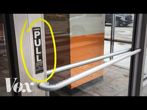
It's not you. Bad doors are everywhere.
 0:02:14
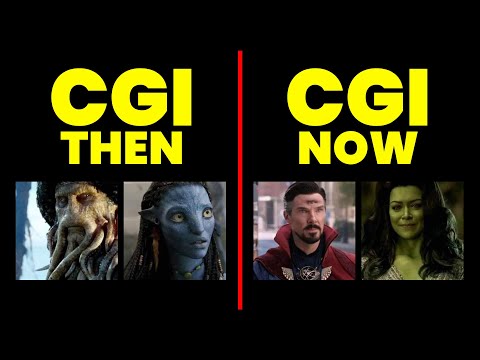
Why is Marvel's CGI is such a JOKE?
 0:15:55
🚨Your Art is NOT the problem…
 0:06:56
You’re using Auto-Layout WRONG
 0:03:36
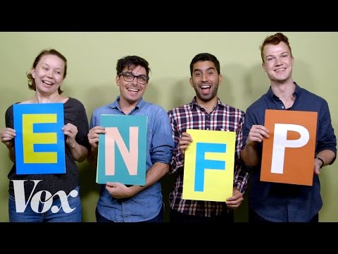
Why the Myers-Briggs test is totally meaningless
 0:03:02
Bad graphic in video -- don't use
 0:04:20
The anatomy of Taylor Swift’s “Style”
 0:00:21
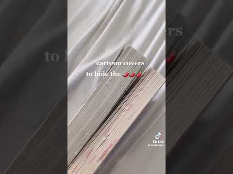
Books with cartoon covers 📚 #shorts
 0:02:40
6 signs your dentist might be ripping you off
 0:00:08
Bad typography test ;-;
Комментарии