filmov
tv
CSS GRID | Display: Grid | Mastering CSS: The Ultimate Guide for Web Developers #chapter43

Показать описание
Welcome to my YouTube channel! In this video, we'll delve into the world of CSS Grid and explore how it empowers you to create dynamic and responsive layouts for your web designs.
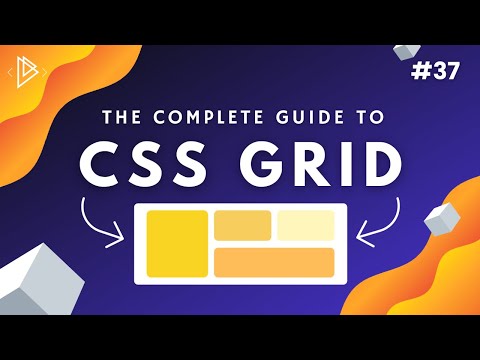
CSS Grid is a powerful layout system that enables you to build complex grid-based designs with ease. With Grid, you have precise control over how elements are positioned and sized within a grid container, making it a go-to tool for creating modern and flexible layouts.
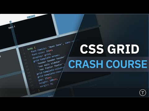
In this tutorial, I'll guide you through the fundamentals of CSS Grid. We'll start by understanding the grid container and its direct child elements, known as grid items. You'll learn how to set up a grid container and define rows, columns, and gaps using the grid-template-rows, grid-template-columns, and grid-gap properties.
We'll explore the different ways to place grid items within the grid, utilizing properties like grid-row, grid-column, and grid-area to specify their placement and spanning capabilities. I'll show you how to create dynamic layouts by combining fixed and flexible sizing units, such as pixels and fractions, and how to handle grid alignment using properties like justify-items, align-items, justify-content, and align-content.
We'll dive into the exciting world of grid auto-placement, where you can allow Grid to automatically position grid items within the grid based on available space. I'll demonstrate how to create responsive grid layouts using media queries, adapting the grid structure and item placement as the viewport size changes.
Throughout the video, I'll provide practical examples and use cases to help you understand how CSS Grid can revolutionize your design workflow. You'll see how Grid simplifies the creation of multi-column layouts, masonry grids, equal-height columns, and more.
By the end of this tutorial, you'll have a solid understanding of CSS Grid and be equipped with the skills to create dynamic and responsive layouts that adapt beautifully to different devices and screen sizes. So join me on this journey to mastering CSS Grid. Don't forget to subscribe and hit the bell icon to stay updated with more CSS tips, tricks, and tutorials. Let's unlock the potential of CSS Grid and take our web designs to the next level! #CSS #webdesign #CSSgrid #gridlayout #responsivedesign #flexibility #griditems #gridsizing #auto-placement #mediamqueries #userexperience
Don't hesitate to ask any questions related to the project. LIKE, SUBSCRIBE.
CSS Grid is a powerful layout system that enables you to build complex grid-based designs with ease. With Grid, you have precise control over how elements are positioned and sized within a grid container, making it a go-to tool for creating modern and flexible layouts.
In this tutorial, I'll guide you through the fundamentals of CSS Grid. We'll start by understanding the grid container and its direct child elements, known as grid items. You'll learn how to set up a grid container and define rows, columns, and gaps using the grid-template-rows, grid-template-columns, and grid-gap properties.
We'll explore the different ways to place grid items within the grid, utilizing properties like grid-row, grid-column, and grid-area to specify their placement and spanning capabilities. I'll show you how to create dynamic layouts by combining fixed and flexible sizing units, such as pixels and fractions, and how to handle grid alignment using properties like justify-items, align-items, justify-content, and align-content.
We'll dive into the exciting world of grid auto-placement, where you can allow Grid to automatically position grid items within the grid based on available space. I'll demonstrate how to create responsive grid layouts using media queries, adapting the grid structure and item placement as the viewport size changes.
Throughout the video, I'll provide practical examples and use cases to help you understand how CSS Grid can revolutionize your design workflow. You'll see how Grid simplifies the creation of multi-column layouts, masonry grids, equal-height columns, and more.
By the end of this tutorial, you'll have a solid understanding of CSS Grid and be equipped with the skills to create dynamic and responsive layouts that adapt beautifully to different devices and screen sizes. So join me on this journey to mastering CSS Grid. Don't forget to subscribe and hit the bell icon to stay updated with more CSS tips, tricks, and tutorials. Let's unlock the potential of CSS Grid and take our web designs to the next level! #CSS #webdesign #CSSgrid #gridlayout #responsivedesign #flexibility #griditems #gridsizing #auto-placement #mediamqueries #userexperience
Don't hesitate to ask any questions related to the project. LIKE, SUBSCRIBE.
 0:13:35
 0:01:51
 0:00:24
 0:00:18
 0:18:35
 0:06:14
 0:43:12
 0:17:14
 1:23:23
 1:02:44
 0:37:04
 0:07:10
 0:11:37
 0:07:01
 0:01:00
 0:02:23
 0:06:51
 0:09:39
 0:00:24
 0:18:51
 0:00:46
 0:06:31
 0:00:40
 0:53:45