filmov
tv
Create 3D Text Emblems with Affinity Designer 2.0

Показать описание
In this tutorial we'll be utilizing some of the new features in V2 of Affinity Designer to create this 3D-style text effect. We'll have to take advantage of the new warp transformations to make this happen. The finished design can work as a logo or emblem.
🔗 RESOURCE LINKS
🎓 EXPLAINER COURSES
▶️ MY OTHER CHANNELS
🎵 MUSIC USED
In Da Mood - Combustibles
#affinitydesigner
🔗 RESOURCE LINKS
🎓 EXPLAINER COURSES
▶️ MY OTHER CHANNELS
🎵 MUSIC USED
In Da Mood - Combustibles
#affinitydesigner
 0:07:57
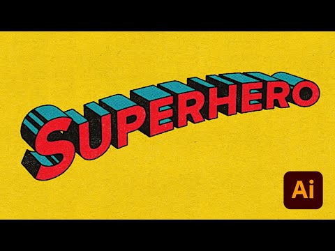
Create 3D Text Emblems with Illustrator
 0:09:46
Create 3D Text Emblems with Affinity Designer 2.0
 0:07:12
Create a Premium & Unique 3d Text Effect in Illustrator - Zed Designs
 0:05:52
Master 3D TEXT in Illustrator in 5 Minutes!
 0:08:21
Create a 3D Text Design in Adobe Illustrator Tutorial
 0:02:02
3D Deep Text Effect In Adobe Illustrator | Deep Hole Design | Illustrator Tutorial
 0:02:09
Create 3D Text in Adobe Photoshop | Tutorial
 0:03:55
Adobe Illustrator 3D Text Effect Tutorial
 0:00:32
3d text effect | adobe illustrator + adobe dimension | malayalam letter 'a' #3d #texteffec...
 0:08:45
This is How to Create Clean & Cool Modern Style 3D Text Effect in Illustrator
 0:01:57
3D TEXT EFFECT in Illustrator - 2 MINUTES Tutorial
 0:08:34
Adobe Illustrator Tutorial - How to Create Custom Typography (HD)
 0:05:43
This is HOW to Design Live Text Effects in Illustrator
 0:07:21
This is How to Create a Premium 3D Text Effect in Illustrator
 0:07:40
How to Make a Vector Halftone Dot Effect Inside a 3D Text Effect | Adobe Illustrator Tutorial
 0:06:26
Adobe Illustrator | Jungle Adventure Typography | Create 100% Editable 3d Text Effect
 0:04:21
3D Text Effect Design Illustrator | Adobe Illustrator Tutorials
 0:08:17
🦸♂️ Superman Comic Book Text Effect Illustrator Tutorial
 0:01:00
Any Circle Logo Design using Grid- Adobe Illustrator Tutorials
 0:00:43
Create INSANE 3D Text Effects in Adobe Illustrator
 0:04:53
Creating a 3D Text Effect using Adobe Illustrator
 0:02:39
How to Design 3D Cube Logo in Illustrator
 0:13:46
How to Make 'Realistic' 3D Text in Adobe Illustrator 2022
 0:04:53
How to Make 3D Text in Illustrator
Комментарии