filmov
tv
How to Create Glassmorphic Elements in HTML & CSS | Glassmorphism Tutorial

Показать описание
Glassmorphism is pretty easy to achieve for front-end developers. There is one main CSS property that we can use: backdrop-filter. This property allows you to apply multiple effects such as blur, sepia, and greyscale to the area behind your component. Since it applies to everything behind the component, to see the effect, you must make this element at least partially transparent.
In this video we are going to learn about creating glassmorphism in HTML & CSS in 6 Minutes.
In this video we are going to learn about creating glassmorphism in HTML & CSS in 6 Minutes.
 0:04:46
Glassmorphism Illustrator Tutorial (Glass Effect) | Beginner Adobe Illustrator Tutorial
 0:06:11
How to Create Glassmorphic Elements in HTML & CSS | Glassmorphism Tutorial
 0:01:19
How To Make Frosted Glass In Premiere Pro
 0:02:07
Create a glass effect in CSS (Glassmorphism)
 0:01:44
Quick Photoshop Tutorial: Glass Effect Version 2
 0:11:39
Trendy Glass Morphism Effect - Illustrator tutorial
 0:12:49
GlassMorphism Style Effect - Photoshop Tutorial
 0:04:33
Unlock the Glassmorphism Effect in After Effects: A Step-by-Step Tutorial
 0:12:43
Glassmorphism Effect in After Effects - After Effects Tutorial
 0:09:38
Easiest way to create GLASSMORPISM Effect on your SMARTPHONE in just about 5 minutes 🤯 (Pixellab)
 0:09:36
'Glassmorphism' New UI Design Trend 2021 + Figma & Xd Tutorial | Design Essentials
 0:04:06
How to make beautiful frosted glass elements in Webflow!
 0:09:38
Glassmorphism Effect in After Effects - After Effects Tutorial
 0:19:03
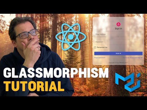
Build a GLASSMORPHISM React Component - Typescript & Material-UI
 0:11:32
Glassmorphism best practices tutorial.
 0:02:17
Photoshop a Realistic Glass Effect in 2 Minutes
 0:17:19
Glassmorphism CSS Tutorial - Login Screen With Elementor Pro
 0:07:25
Create Glass Morphism Motion Graphics in After Effects
 0:01:39
How To Create Glass Morphism Effect In Premiere Pro
 0:02:11
Glass Morphism Effect Photoshop Tutorial
 0:06:02
How to create a glass effect in Adobe XD | Glassmorphism tutorial
 0:04:37
How to make a Glass Effect | Adobe Illustrator
 0:09:27
CSS Glass Morphism User Card Interactions | Glassmorphism UI Design
 0:03:46
How to Glass Effect (EASY Beginner Canva Tutorial)
Комментарии