filmov
tv
Python Tutorial: Introduction to Seaborn

Показать описание
---
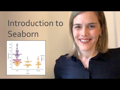
Welcome to this introduction to Seaborn. My name is Chris Moffitt and I will be your instructor for this course. I have been using Python for over 10 years and am currently the creator of the popular blog Practical Business Python. I am excited to show you how to effectively use the Seaborn library for creating insightful visualizations.
The Python visualization landscape is complex and it can be challenging to find the right tool for the right job. Before we discuss Seaborn in detail, it is helpful to understand where it stands in this landscape. This illustration is from Jake VanderPlas' pycon 2017 presentation on the visualization landscape in Python and highlights the complex ecosystem. The key point is that matplotlib is a foundational library used by many visualization tools including Seaborn.
matplotlib is a robust library that can support building many types of visualizations. Seaborn uses it to construct statistical visualizations. When working with Seaborn, it is helpful to understand some of the underlying matplotlib constructs. This brief example shows how to plot a column in a pandas DataFrame as a histogram. This specific example includes information about the alcohol content of several different types of Portuguese wines. If you do not understand this code example, you may want to review some introductory Python courses. The rest of this course will assume you understand basic Python and pandas usage.
pandas is one of the most important Python libraries for manipulating and analyzing data. In addition to providing powerful data manipulation tools, pandas supports basic data plotting functions. The actual API is consistent with other pandas functions, so it is a very useful tool. The plotting is carried out by matplotlib, so the resulting output looks very similar to the pure matplotlib output. This functionality is very useful when you need to quickly look at data that is already in a DataFrame.
Seaborn integrates with the rest of the Python data science landscape by leveraging matplotlib and integrating with pandas. In this example, a plot similar to a histogram can be created using Seaborn's distplot() function. The resulting output looks like a histogram but actually is a Gaussian kernel density estimate or KDE. In the next slide we will compare this output to the pandas generated histogram.
This relatively simple example is illustrative of how to use Seaborn. The code is simple but can be used for powerful data analysis. In addition to the analysis, it makes reasonable assumptions about colors and other visual elements to make visualizations that look more pleasing than the standard matplotlib plots. Additionally, Seaborn performs statistical analysis on the data to generate the KDE.
Now it's your turn to try out Seaborn.
#PythonTutorial #DataCamp #Data #Visualization #Seaborn #python #distribution #plot
 0:03:17
 0:04:10
 0:07:27
 0:16:47
 0:29:03
 0:59:34
 0:40:44
 0:22:39
 2:41:11
 0:24:22
 4:22:13
 0:08:48
 0:20:41
 0:03:49
 1:36:27
 0:11:35
 0:20:11
 0:51:12
 0:04:15
 0:15:46
 0:15:03
 0:17:36
 0:22:01
 0:14:30