filmov
tv
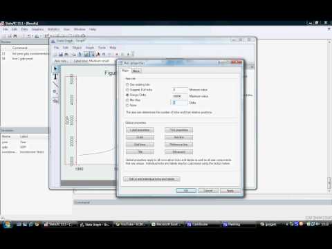
Graphs in STATA: Line Graph with Customization

Показать описание
In this playlist, we'll take a look at different kinds of data visualization tools in STATA. We start with a sample dataset for our tutorial and in each separate video we discuss different types of graphing techniques, such as: line plots, connected line plots, scatter plots with linear fits, scatter plot matrix, histogram with normal and kernel density plots, boxplots and combining graphs.
Tags:
#economics #math #stata #rstudio #r #python #optimization #dataanalysis #data #dataset #bigdata #statistics #proof #microeconomics #macroeconomics #econometrics #graps #visualization #coding #input #output #modelling #inputoutput #multiplier #pythonprogramming #pythontutorial #economy #reading #processing #régression #regression #logit #valuation #finance #financialeducation #excel #exceltutorial #pivot_table #timeseriesanalysis #timeseries #panel #population #sample #hypothesis #hypothesistesting #public #publication #proof #realanalysis #calculus #probability #supplychain
 0:08:17
Graphs in STATA: Line Graph with Customization
 0:03:01
Graphs in STATA: Connected Line Graph
 0:02:48
Line Options for Stata Graphs | Stata Graphics and Data Visualization | Stata Tutorials Topic 14
 0:03:16
Editing Graphs in STATA by Charles Natuhamya
 0:04:25
How to create a trend line graph in STATA software
 0:03:05
Time series set data and generate a line graph in Stata
 0:11:08
Creating and Editing Graphs in Stata
 0:07:21
Combining graphs in Stata (Sept, 2021)
 0:03:29
Creating Graphs in STATA: Getting Started
 0:03:32
EC6054-2012 Tutorial 12 - Generating a Line Graph in Stata
 0:03:52
How to Draw Line Plots in Stata? | Stata Graphics and Data Visualization | Stata Tutorials Topic 8
 0:15:39
Stata - How to draw (nice) line graphs
 0:06:56
Stata Graphics 2: two Y axes (English version)
 0:00:41
Twoway scatter and fit line
 0:11:48
STATA Graph & Chart Data Analysis in 12 Minutes
 0:04:17
How to Draw Best Fit Lines in Stata? |Stata Graphics and Data Visualization |Stata Tutorials Topic 9
 0:01:02
G 2 graph twoway line 3 variables
 0:03:22
Time series in Stata®, part 2: Line graphs
 0:00:39
G 2 graph twoway scatter 3 variables
 0:14:28
Create and Edit Economics Graphs in Stata
 0:00:52
New in Stata 18: New default graph scheme
 0:04:53
Stata Tutorial: Scatterplots and Fitted Lines
 0:07:11
Stata Lecture 20: How to create your Graphs, Plots, and Images?
 0:05:32
Introductory Stata 43: Graphs For Two Continuous Variables (Line plots)
Комментарии