filmov
tv
Introductory Stata 43: Graphs For Two Continuous Variables (Line plots)

Показать описание
Let's continue to examine the graphs for two continuous variables. Today, we will take a look at the line plots. Line plots are often used to show the trend of a variable over time. The time variable is often placed on the x-axis. If the x variable is not a time variable in natural order, we should have the data sorted before we draw the line plots.
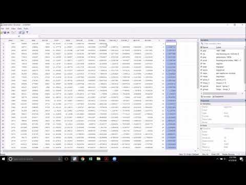
Let's open a dataset I created from the Current Population Survey (CPS) for the households in the United States.
********************
*43. Line plots *
********************
capture log close
set showbaselevels on
*Use the dataset I created for US households
*line plot
graph twoway (line income year)
graph twoway (line income year, xlabel(2000(1)2021, angle(45)))
*line options
graph twoway (line income year, connect(stairstep))
graph twoway (line income year, connect(stepstair))
graph twoway (line income year, lpattern(dash) lcolor(blue) lwidth(thick))
*line plot with scatterplot
graph twoway (line income year) (scatter income year)
graph twoway (scatter income year, connect(l))
*multiple line plots
graph twoway (line inc_metro year) (line inc_nonmetro year)
graph twoway (line inc_metro year, lcolor(blue)) (line inc_nonmetro year, lcolor(orange)), legend(order(1 "Household income in metro area" 2 "Household income in non-metro area") col(1))
*multiple line plots with two y axes
generate difference=inc_metro-inc_nonmetro
graph twoway (line inc_metro year) (line inc_nonmetro year) (line difference year), legend(order(1 "Household income in metro area" 2 "Household income in non-metro area" 3 "Difference") col(1))
graph twoway (line inc_metro year, lcolor(blue) yaxis(1)) (line inc_nonmetro year, lcolor(orange) yaxis(1)) (line difference year, lpattern(dash) lcolor(black) yaxis(2)), legend(order(1 "Household income in metro area" 2 "Household income in non-metro area" 3 "Difference") col(1))
log close
#Line #TwoYAxes
 0:05:32
 0:02:53
 0:02:48
 0:04:30
 0:03:52
 0:00:40
 1:43:26
 0:00:59
 0:11:22
 0:12:05
 0:08:59
 0:43:21
 0:02:37
 0:46:16
 0:04:43
 0:42:16
 2:03:39
 0:13:04
 0:07:54
 0:07:15
 0:10:43
 0:15:43
 0:13:15
 0:31:14