filmov
tv
Discord's New Logo Sucks (And Similar Logo Change Fails)

Показать описание
Discord has a new logo, and it looks terrible! Let's compare it to other logo 'change' fails. Here's why the new logo sucks and why the old one is better as well (kinda). Enjoy! :)
Leave a like to show Discord the new logo is worse!
Leave a like to show Discord the new logo is worse!
 0:00:47
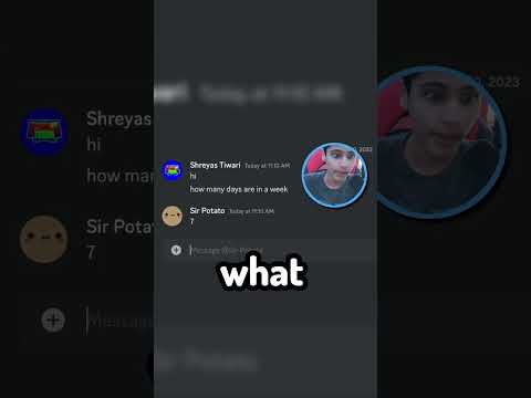
You Will Get Banned On Discord if You Say THIS
 0:06:21
Discord has a new logo...
 0:13:28
What's WRONG with The NEW Discord Logo? 🧐 2021
 0:00:14
discord's Remix tool is now out of early access and available to everyone on mobile.
 0:02:53
DISCORD LOGOS are turning ORANGE...
 0:00:30
new discord logo speedrun any%
 0:13:30
discord is absolutely disgusting...
 0:10:29
Discord Just Nerfed Uploads... (and added a New Badge)
 0:04:01
roblox discord racing league be like
 0:01:13
New Discord Logo Speedrun WR
 0:00:18
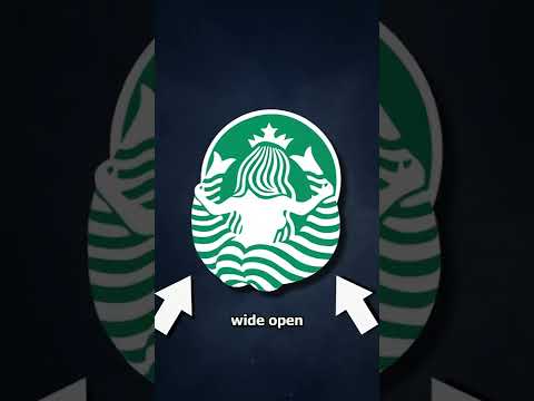
Starbucks Has A Secret 😱 (EXPLAINED)
 0:00:13
Your favorite Discord bot is shutting down 😢
 0:00:31
The WORST Programming Languages EVER #shorts
 0:00:12
I GOT HACKED IN DISCORD (Nitro hack)
 0:01:14
Trump Phone Bad
 0:08:49
Did Discord SCREW UP their New Design?
 0:00:42
THIS DISCORD BOT BANS ROBLOX PLAYERS
 0:05:59
The Roblox FreeDraw situation is BAD...
 0:14:40
The Down Bad Side of Discord
 0:00:49
The SCARIEST Nintendo Switch errors...
 0:00:41
im sorry mojang.
 0:09:06
I Fully Renovated a Bad Discord Server — Server Overhaul: Episode 1
 0:12:06
The Worst Website on Discord...
 0:00:15
trolling as a fake egirl in discord
Комментарии