filmov
tv
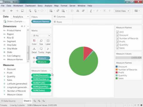
How to Create a Pie Chart in Python?

Показать описание
You may know how to create a pie chart in Excel, but do you know how to create a piе chat in Python. If you are a business analyst, data scientist, data analyst or any person who works with data, you need to be able to visualize data and present valuable insights that guide organizational decision-making.
Knowing how to plot this essential graph for data visualization in one the most popular environments, using powerful data visualization libraries is a must. In this 365 data science tutorial you are going to use the pandas, seaborn and matplotlib library to plot our pie chart.
Once you follow along and execute your pie chart you are going to learn how to make improvements to the pie chart, such as adjusting the size of the labels, how to add other properties in the text props parameter called , play around with the color palette and set it to colorblind , make the chart more readable and create a legend.
► Consider hitting the SUBSCRIBE button if you LIKE the content:
365 Data Science is an online educational career website that offers the incredible opportunity to find your way into the data science world no matter your previous knowledge and experience. This is why we have dedicated this channel to those who are completely new and are curious to explore the wonderful world of data science. Once you have built a basic theoretical knowledge you can sign up to our comprehensive curriculum where we have prepared numerous courses that suit the needs of aspiring BI Analysts, Data Analysts and Data Scientists.
#piechart #datavisualization #python #365datasciencetutorials
 0:00:41
 0:02:16
 0:02:43
 0:04:17
 0:03:16
 0:00:28
 0:15:53
 0:08:38
 0:06:28
 0:00:53
 0:00:30
 0:05:35
 0:06:01
 0:00:20
 0:08:36
 0:00:40
 0:05:13
 0:00:58
 0:00:33
 0:00:41
 0:02:08
 0:02:55
 0:13:31
 0:00:51