filmov
tv
Alice In Wonderland : Side-by-Side Comparison (Before & After 2014 Refurbishment) - Disneyland

Показать описание
Side-by-Side video comparison of 'Alice in Wonderland' before and after the 2014 refurbishment. Having the Before and After videos next to each other really lets you notice and appreciate all the big and small changes Disney brought to the ride.
Leave a comment and let me know what your favorite change to the ride is. I love the new Tea Party ending and the extra Alice figures they added in the ride.
Make sure to visit Disneyland soon so you can experience 'Alice in Wonderland' in person.
Thanks for watching! Your 'Likes' and 'Comments' on my videos mean the world to me. You guys ROCK!
Wishing you a 'Very Happy Unbirthday!'
Dan
Alice in Wonderland (1933/1951/1985/1999) side-by-side comparison
Alice In Wonderland : Side-by-Side Comparison (Before & After 2014 Refurbishment) - Disneyland
Alice In Wonderland | Voice Actors | Behind The Scenes | Side By Side Comparison
24 Reasons Alice in Wonderland & Hangover Are The Same Movie
Alice In Wonderland Side by Side Comparison Before & After 2014 Refurbishment Disneyland
Alice in Wonderland ✨ Amazing||2k||#shorts#aliceinwonderland
The Dark History Behind Alice In Wonderland 🍄 #shorts
Alice Meets The caterpillar - Alice In Wonderland (1951)
Disney’s Alice in Wonderland Tiny Tarot ~ Walkthrough & First Impressions!
How Alice in wonderland 1950 looks like at 60 fps side by side comparison
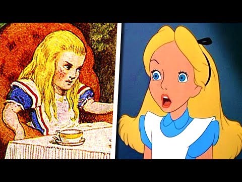
Alice In Wonderland Live-Action Side by Side Animation
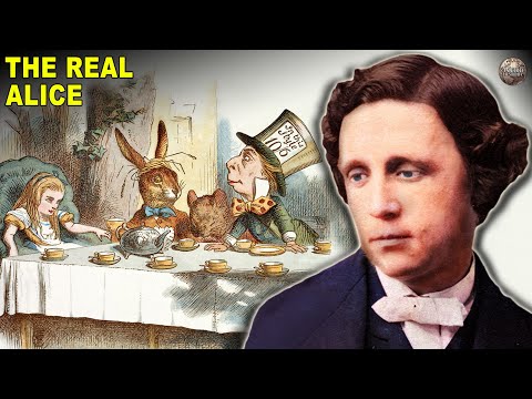
The Real Alice In Wonderland Lewis Carroll Had an Unusual Relationship With
Did You Know In ALICE IN WONDERLAND…
Alice in Wonderland - Tea Party HD
Welcome to Wonderland of Side-by-side #shorts #coloringfun #healingwithcolouring #aliceinwonderland
4K 3D HDR | Trailer - Alice in Wonderland | Dolby 5.1
The Messed Up Origins of Alice in Wonderland (Pt. 1) | Disney Explained - Jon Solo
Alice's Adventures in Wonderland - The Mad Hatter (Steven McRae) #shorts #tapdancer #ballet
Unraveling Alice's Madness: Reality vs. Wonderland
alice in wonderland ride-side by side
The Beatles & Alice In Wonderland Sync
Crack 18 Riddles to Help Alice Escape from Wonderland
You're Using Alice in Wonderland Wrong
1903 Alice In Wonderland Before & After Restoration
Комментарии
 0:04:15
 0:03:44
 0:06:39
 0:03:04
 0:03:44
 0:00:45
 0:00:47
 0:04:41
 0:20:19
 0:04:26
 0:00:24
 0:10:47
 0:00:22
 0:02:46
 0:00:16
 0:01:51
 0:17:31
 0:00:58
 0:00:51
 0:02:24
 0:00:44
 0:11:36
 0:15:21
 0:00:03