filmov
tv
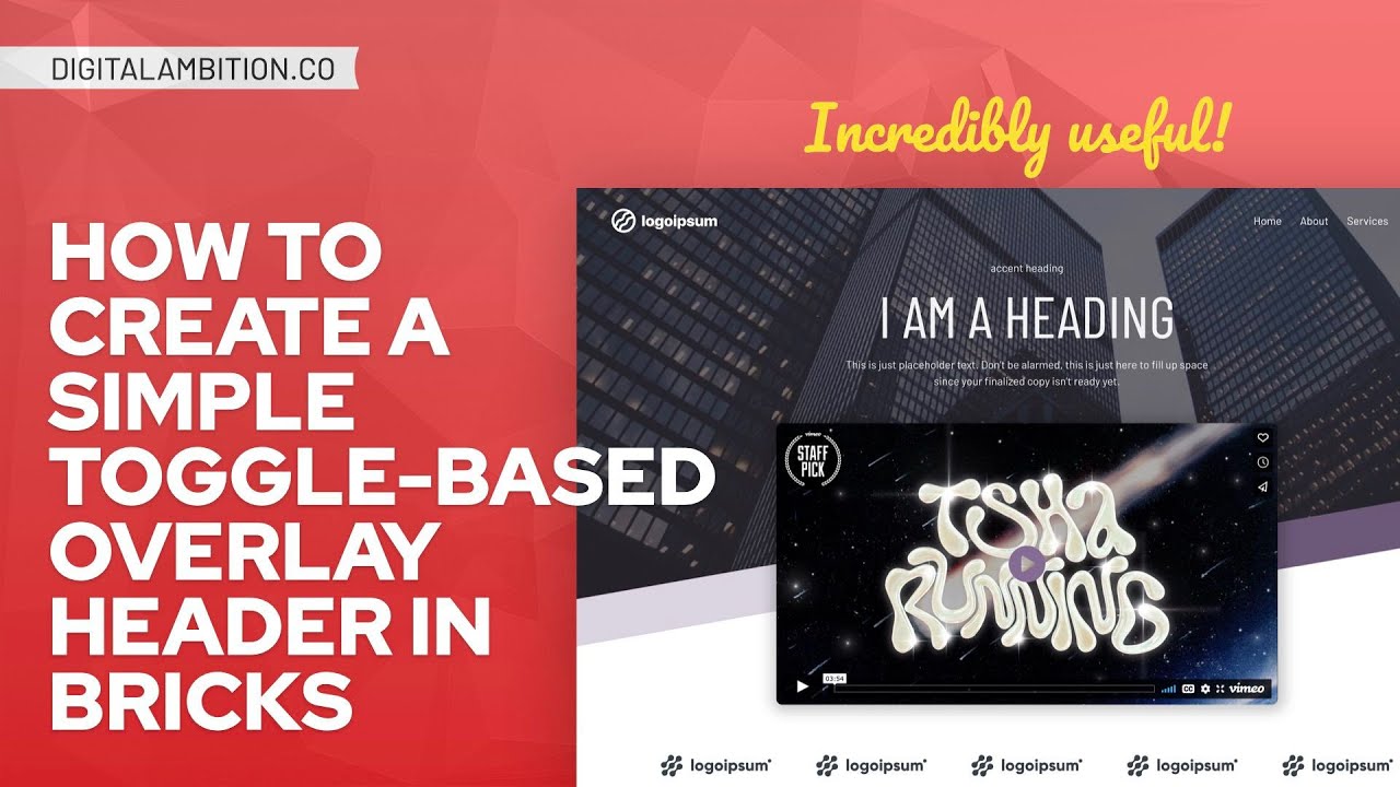
How to Create a Simple Toggle-Based Overlay Header in Bricks Builder
Показать описание
Overlay headers are very modern and visually appealing. Unfortunately, they make websites more difficult to manage because they require special design considerations and potentially limit what you can do with hero sections.
BUT ... what if we could selectively apply an overlay header style to a given page while retaining a standard header on all other pages by default? That would be very powerful!
AND ... what if we could choose between an overlay header and a traditional header without having to manage two separate headers? That would be way better!
That's exactly what I'm going to show you how to do in this tutorial. And you'll learn some other great stuff along the way, like using and styling data attributes, Metabox custom fields, Bricks dynamic data, Bricks conditions, and more.
00:00 Intro
00:46 Example
05:10 Getting Header Template Ready
06:46 Creating a Toggle With Metabox Custom Fields
09:50 Data Attributes
14:30 Styling the Data Attribute
20:44 Swapping the Logo
26:40 Wrap-Up
How to create a Simple Dashboard Report in Microsoft Excel
The Absolute FASTEST Way to Create a Simple Website in Less Than 10 Minutes
How to Create a Simple Process Map (With Examples)
How to Create a Simple Composite in Photoshop
8. How to Create a Simple HTML Page (Hindi)
Create Simple Personal Portfolio Website with HTML & CSS | Step by Step Tutorial
How to Create a Simple Makefile - Introduction to Makefiles
Create a Simple Neural Network in Python from Scratch
Create PDF Files with Python | Simple PDF Generation Guide #pythonprogramming
How to Create Simple Mandala Design in Illustrator - Adobe Illustrator Tutorials
HOW TO CREATE SIMPLE LOGO IN ADOBE ILLUSTRATOR
How to create a simple Qt Quick application
Autocad - How to create a simple Titleblock!
HOW TO CREATE A SIMPLE WEBSITE USING HTML AND CSS PART -1 (TAMIL)
How To Create Simple Cover Art Design in Photoshop | Photoshop Tutorial
How to create a simple sign in Vectric software | Getting Started | V12 Tutorials
Simple Scene to Create in Blender! (Step by Step Guide)
How to Create a Simple Sign Up Form - Google Forms
How To Create a Simple Animation Movie In Notepad Using HTML | Animation In HTML | Html Animation
How to Create a Simple Website Layout using HTML CSS
How to Create a Simple WordPress Plugin | 2021 WordPress Tutorial
How to Create a Simple Cash Book in Excel
How to create a simple select query in Microsoft Access
Simple Scene to Create in Blender! (Step by Step Guide)
Комментарии
 0:18:56
 0:06:02
 0:11:52
 0:24:19
 0:04:17
 0:21:57
 0:09:24
 0:14:15
 0:00:20
 0:00:59
 0:01:04
 0:08:52
 0:12:45
 0:12:46
 0:05:50
 0:21:33
 0:10:09
 0:04:30
 0:06:02
 0:04:53
 0:07:51
 0:17:38
 0:02:18
 0:08:01