filmov
tv
Dynamic LAST & PREVIOUS 12 Months in a Chart and Table | Power BI

Показать описание
One thing I’ve found, in my many years of creating reports in Excel and then Power BI, is when working with monthly reports for clients they were static, as of that month, looking back 12 months and the only way clients could see the previous month's last 12 months was to look at an old report.
This is what led me to find a way to change that by creating moving last 12 months based on the month and year selected and in this video, I show you how.
#powerbi #dax #powerquery
📁 Dataset for Sales Data and file for original dim date table M code
▶️ Link to Rick’s original video I learnt the DAX from for last 13 months
▶️ Video clips used in intro
🔖c h a p t e r s 🔖
00:00 - Intro
00:36 - Overview of how it works
02:28 - Create a copy of your date table
02:28 - Create 'MonthYear' column
03:44 - Create 'MonthYear' sort column
04:14 - Set sort for 'MonthYear' column
05:25 - Create last 12 months dax measure
11:28 - Create previous last 12 months measure
12:54 - High and low conditional formatting
16:21 - Add measure to conditional format
17:32 - Create dynamic title measure
18:20 - Add dynamic title measure to title
 0:18:59
Dynamic LAST & PREVIOUS 12 Months in a Chart and Table | Power BI
 0:09:33
#Tableau dynamic date parameters to choose Current Week, Last 4 Weeks and Last 12 Weeks in Tableau
 0:03:31
Dynamic Column Header for Month Year in Power BI is POSSIBLE | Current & Previous Month Name Hea...
 0:13:53
Previous Dynamic Period using DAX in Power BI
 0:06:34
Ultimate Current Vs Previous Period Comparison Slicer in Power BI⚡️ Dynamic Period Comparison Slicer...
 0:07:38
Dynamic Names in Column Header is POSSIBLE⚡ Selected Year, Previous Year & Variance All - Power ...
 0:02:55
Dynamic Date Range/Period Filter in PowerBI
 0:06:17
Set a Dynamic/Default/Changing Date in Power BI Date Slicer
 0:03:17
Forget iPhone 16? Apple iPhone 17 Pro MAX is WORTHY - Top 4 New Game-Changing Features!
 0:08:47
Power BI - Dynamic Previous Period Metrics based on Date Hierarchy Level
 0:05:12
Power BI DAX & Filter: A Dynamic Date Time Shift Approach for Report Visualizations
 0:13:21
Dynamic Time Period Comparison With Power BI
 0:08:54
Tableau Dynamic Parameter for Selecting Most Current Date or Default Value
 0:10:20
How to Create Dynamic Variance Charts with Arrows | Show Change to Previous Year / Budget
 0:20:34
Dynamic Last N Weeks Trend - Problem Of The Week #5 (DAX Solution)
 0:06:49
Power BI - Dynamic Total Between Two Dates - Date Slicer Latest Selected Date and 2 weeks back Date
 0:07:52
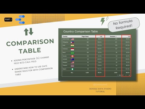
GDS Dynamic Date Comparison in Table Chart (Compare to Previous Period)
 0:56:54
12 Dynamic Gambits! | The Dynamic Dozen
 1:00:58
Dynamic Circuits - Day 10 of 12 Days of Qiskit
 0:49:16
12 Endgames That Every Player Should Know! | The Dynamic Dozen
 0:01:08
Add Dynamic Total By Row Custom Column in Power Query
 0:28:25
Longest Increasing Subsequence (Dynamic Programming)
 0:05:41
TARGIT Tip of the Month: Reduce the hassle of 'Dynamic date origin'
 0:00:44
WWE 12' - The Undertaker's Dynamic Comeback Moment (WWE 12 Footage)
Комментарии