Design Perfect Scoops for Mass Production 3D Printing
preview_player
Показать описание
Learn how to design a scoop optimized for 3D printing, whether for mass production or print-on-demand. We explore the challenges of 3D printing traditional designs meant for injection molding and share expert tips on modifying a scoop to be perfectly suited for 3D printing. Discover how to minimize supports, improve surface quality, and leverage the unique capabilities of 3D printing to create functional and competitive products. Perfect for 3D printing hobbyists, entrepreneurs, and anyone interested in bringing their unique designs to life. Watch now to unlock new design possibilities and get ahead in the world of 3D printing!

#3dprinting #designfor3dprinting #3dprintingideas #3dprintingdesign #3dprintingtips

🔗 OTHER IMPORTANT LINKS 🔗

About Slant 3D

🏭 High-Volume 3D Printing: Scalability Meets Flexibility
Slant 3D's Large-Scale 3D Print Farms utilize 1000's of FDM 3D printers working 24/7 to offer limitless scalability and unparalleled flexibility. Whether it's 100 or

100,000 parts, our system can handle it reliably, while still allowing for real-time design updates, ensuring products evolve with the times. This adaptability is key in today's fast-paced world.

🌿 Sustainable Manufacturing: Eco-Friendly Efficiency
Embrace a system that drastically reduces carbon emissions by eliminating carbon-intensive steps in the supply chain, such as global shipping and warehousing. Our approach minimizes this footprint, offering a more sustainable manufacturing option.

⚙️ Digital Warehouses: Parts On-Demand
Think of print farms as a "Digital Warehouse", meaning we can store your parts digitally on a server rather than physically on a shelf. parts are available on-demand, reducing the need for extensive physical inventory.

*As an Amazon Associate, I earn commission from qualifying purchases.*

Produced by Geometry Media
Рекомендации по теме
Комментарии
Автор

The handle at the bottom is going to constantly make the scoop want to tip either way and twist in your finger. The reason for the handle on the top(above the product your scooping) is to add stablity and keep you from accidentally dumping the product.

mat-
Автор

So basically you made a small mug without a hole for the fingers in the handle. Also why not print it at a 45 degree angle with a small 45 degree cut-out at the bottom for bed adhesion in this case? that way you can print the handle up design without support and its easier to eject. I remeber you mentioning this was a factor for automization

timlilli
Автор

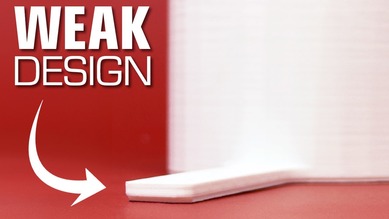
The revised hadle with the big slab is ergonomically horrible.. both with and without the big chamfer. But the bottom-handle design has a lot of promise. Either way, thanks for sharing these ideas with the community.

jeremiahbullfrog
Автор

I suggest adding a pair of shallow indents on both sides of the final handle, suggesting to the user, "Grip here."

alang
Автор

I don't know man, it looks kinda garbo. does it really need to be so chunky? the scoop part being thin would make it easier to use, less resistance.

abowden
Автор

I’ve been a hobbyist in the 3D printer space for 10 years now and after watching this video I just realized I’ve never tried to recreate an injection molded part. If I had to repair something I just went straight to taking measurements and figuring out a design that worked best for FDM printing.

I remember the first time I tried designing a part I didn’t care about overhangs, fillets, or chamfers, and just made a part that worked great in CAD. But after it turned to a spaghetti mess on the build plate I learned my lesson immediately to design with FDM from the start. And I love these videos for helping me reinforce that thinking and also teaching me some new ways of designing. Something as simple as a scoop has a lot of thought in it to make it easy to manufacture, cost effective, useable, functional, and aesthetically pleasing (if applicable).

Whiskeyj
Автор

The design of scoops made for thousands of years were bound by modern injection molding. I really learn something new daily.

samiam
Автор

To be fair, when you value traditional feel while having internals more clear so less crap gets inside the scoop - having a handle with supports is ok, especially if this scoop has to be used in a long deep container. I did design a few scoops earlier past year, I did go with a traditional molded design. I know about those tricks you mention and they're nice, but situational. Not everybody will be happy with powder inside layers or with weird handle.

SneakyJoeRu
Автор

I knew an EE Prof who confessed he fixed a broken coffee cup handle with hot melt glue.
But, no, seriously, folks, you are really good, and I know you will be even better when you calm down.

tomcarroll
Автор

Wow I can not believe we went throu a hole 3D printing redesing and he didin't printed in 45 degrees to minimize bed contact. Just kiding, I love this content. I was wondering is there some kind of coating to make the prints food safe? similar to the water bottle aporach? TY so much for the video guys!!

GGDiegoNeira
Автор

Start exporting STEP files instead of STLs and you won't see those straight lines on the cylindrical part of the design.

tanmaypathak
Автор

Ngl, was kind of expecting the final result to be like the 3D printed spoon design, tho I can't say I wasn't expecting any of the variants. Guess your "design for 3D printing" videos have been doing their job Keepo

TS_Mind_Swept
Автор

Printing at 45° was not covered in this episode)
As usual thank you for the interesting exercises!

oleksandrn
Автор

putting the handle on the bottom is mind-blowing. great job!

bezhsyl
Автор

Another great video on how to approach designing “stuff” for 3D printing. 10 times more useful than hours of printer, slicer, filament comparisons.

paulcrabb
Автор

You can also taper the measuring scoop so that it acts as a sort of funnel as you place coffee into a refillable coffee pod for pod style coffee makers as I designed 3-4 years ago for my use.

jeromefeig
Автор

Really good approach.
Gabe, I know you have a tight schedule, but I believe that a lot of people here would be interested in attend to a lecture or class about 3D print specific design. Think about it.

marcelizzi
Автор

Another improvement is t make the handles be hollowed (part of the cavity) and tapered so they can nest together like normal measuring cups. That is a benefit of having the handle at the top (plus the fact then the weight is under the handle and is much more controllable)

willofthemaker
Автор

What about bridging? I guess it's not always going to produce a clean inside bottom of the scoop

WillPower
Автор

I love these iterative redesign 3D printing optimization videos. I would have made the first attempt scoop with a conical bottom on the outside as well as inside, because I think that looks and works better than a cylindrical outside to look like a conventional scoop with a conical bottom on the inside. On the version with the chunky tab handle, I'd scallop some dimples into the sides of the handle to make it more ergonomic, or maybe cut a geometrically matching inset on both sides and chamfer the edges.

My iterative design would probably end with a conical scoop bottom (same wall thickness throughout the scoop) because that scoops and dumps powder better, with a bottom chamfered full height tab handle with embossed side panels to improve the grip.

LibertyEver