filmov
tv
Plotting in R tutorial: Gorgeous graphs with ggplot2
Показать описание
Learn how to use the ggplot2 library in R to plot nice-looking graphs and find out how to customize them in this step-by-step guide.
Loading in the data 01:10
Working with times using lubridate 03:05
Your first ggplot 05:58
Different geoms 08:37
Fixed variables and aesthetics 09:05
Faceting 11:44
Histograms 13:00
Converting a variable into a factor and accessing help 14:05
Bar graphs 16:05
Stacked bar graphs 17:07
Grouped bar graphs 18:34
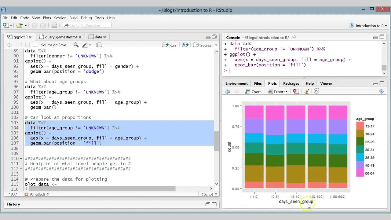
Proportion bar graphs 20:06
Basic heatplot 21:30
Advanced heatplot, including labels, new colours and text 25:54
Loading in the data 01:10
Working with times using lubridate 03:05
Your first ggplot 05:58
Different geoms 08:37
Fixed variables and aesthetics 09:05
Faceting 11:44
Histograms 13:00
Converting a variable into a factor and accessing help 14:05
Bar graphs 16:05
Stacked bar graphs 17:07
Grouped bar graphs 18:34
Proportion bar graphs 20:06
Basic heatplot 21:30
Advanced heatplot, including labels, new colours and text 25:54
 0:45:52
Beautiful Charts with R & ggplot2 (Step-By-Step Tutorial for Beginners)
 0:10:30
R tutorial: Creating Maps and mapping data with ggplot2
 0:05:39
R Tutorial - Making Basic Graphics in R
 0:08:28
Add and Customize Legends to Plots in R | R Tutorial 2.11| MarinStatsLectures
 0:28:46
How I make beautiful GRAPHS and PLOTS using LaTeX
 0:04:30
R Tutorial - Customizing Your Plots In R
 0:15:16
How to Modify and Customize Plots in R | R Tutorial 2.9 | MarinStatsLectures
 0:47:33
Plotting in R for Biologists -- Lesson 6: Plot anything!
 0:17:23
3. Box Plots and ANNOVA in R - Two Factor Experiment - Prof. Dr. Sajid Ali
 0:16:02
ggplot2 Tutorial | ggplot2 In R Tutorial | Data Visualization In R
 0:06:36
R Tutorial - How to plot multiple graphs in R
 0:07:58
Add and Customize Text in Plots with R | R Tutorial 2.10 | MarinStatsLectures
 0:19:30
R Tutorial to build Beautiful Artistic Maps with OSM Data
 0:31:46
Scatterplot tutorial in R
 0:13:25
R-Studio Tutorial: Multiple Lines in One Plot With GGPlot
 0:24:42
Rebuild this COMPLEX Data Visualization with R | A ggplot2 Tutorial
 0:28:41
Create Simple Graphs in R Studio | R Beginners Graphs Tutorial | Bar Plot | Scattered | Box Plot
 0:08:00
How to Combine ggplots | A Step-By-Step Tutorial
 0:02:23
Stem and Leaf Plots in R | R Tutorial 2.5 | MarinStatsLectures
 0:09:15
R Programming Tutorial - 17 - Charts and Graphics
 0:34:11
Introduction to ggplot2 Package in R | Data Visualization Tutorial for Beginners & Advanced Exam...
 0:22:47
Plotting in R for Biologists -- Lesson 1: From data to plot with a few magic words
 0:04:32
R Tutorial: Adding aesthetics to represent a variable
 0:06:03
R Tutorial - 014 - How to create density plots with ggplot2
Комментарии