filmov
tv
The 3 most common slides at McKinsey, BCG, and Bain

Показать описание
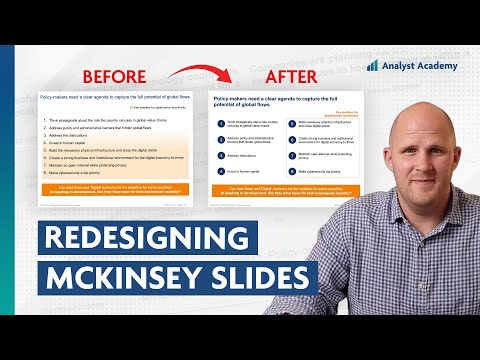
Here are the three most common slides used by big name consulting firms like McKinsey, BCG, and Bain. The first is a table slide. It's basically just a table with a column of categories on the left and details and data on the right. Slides like this are good for showing categorical information or for showing lists, like a list of recommendations. Just use regular boxes for the categories on the left, bullet points for the columns on the right, then add subtitles to those columns. The second slide is a chart slide. It's just a title on top with the main message, then a chart that takes up the width of the slide, that supports that main message. Slides like this are good when you're trying to make a convincing point and you have the data to do that.
The next is the subtitle slide. Just a title on the top with two or three different sections and a subtitle for each of those sections. Slides like this are good for showing structure, like when you're trying to show your audience how you reach a certain conclusion. To build this slide, just start with a box for the subtitle, copy that down and change the formatting so it can be bullet points, and then copy that over two or three times. Master these three slide types and you'll be building presentations like a pro in no time.
=============================================
📣 FREE STUFF
🏆 COURSES
🎬 VIDEOS
🚀 MORE STUFF
*Affiliate relationship
=============================================
ABOUT US
All views expressed on this channel are that of Analyst Academy LLC and its employees. Any materials mentioned or shown have been obtained through publicly available sources (e.g. firm or client website).
#powerpoint #presentations #consulting #datavisualization
Комментарии
 0:00:59
 0:11:02
 0:00:59
 0:00:46
 0:02:12
 0:00:11
 0:00:58
 0:00:44
 0:00:14
 0:01:01
 0:00:32
 0:00:16
 0:00:11
 0:00:59
 0:00:12
 0:00:33
 0:17:27
 0:01:00
 0:10:09
 0:00:17
 0:00:22
 0:00:21
 0:00:08
 0:01:01