filmov
tv
How to create HR Analytics Dashboard by using Power BI in 30 Mins | Microsoft Power BI Dashboard |

Показать описание
#businessintelligence #microsoftpowerbi #powerbi
Hi Family !
Building a Power BI dashboard from scratch is an achievable but challenging task for many. It requires having an understanding of the data you want to display and how it should be structured in order to tell a compelling story. To create one successfully, it's important to start with a clear goal and define the type of data visualizations that will best convey your message. Once you've identified what needs to be included, you can then work on creating visuals, including charts, tables, and graphs.
Additionally, you'll need to consider incorporating interactive elements like slicers, bookmarks, and other filtering capabilities so that users can customize their view of the data as needed. With these pieces in place, all that's left is polishing off your dashboard design by adjusting colors, fonts, backgrounds, and adding annotations or relevant images. Through careful planning and attention to detail, anyone can create a powerful and informative Power BI dashboard from scratch.
In this video, you will learn how to develop a Interactive HR Analytics Dashboard in Microsoft Power BI.
In this dashboard we have learned how to create Card Visuals with Logo, Pie chart visuals, Bar and Clustered Column chart, Matrix(Table) Visual and Heat Map along with different slicer's and it's formatting.
#datascientist #sharepoint #dax #microsoftexcel #dados #dataviz #analisededados #sqlserver #dataanalyst #ai #crm #powerplatform #programming #erp #tecnologia #microsoftdynamics #powerquery #qlikview #inteligenciadenegocios #indicadores #microsoftteams #artificialintelligence #powerbidesktop #powerpoint #n #qlik #onedrive #it #msdyn #yammer# powerbi #microsoft #businessintelligence #excel #dataanalytics #datascience #data #tableau #datavisualization #sql #dashboard #office #analytics #python #business #dynamics #bi #software #bigdata #digitaltransformation #azure #dataanalysis #powerapps #machinelearning #technology #dashboards #microsoftpowerbi #o #cloud #businessanalytics
 0:21:05
How to build an Interactive HR Dashboard in Excel | HR Analytics in Excel [2024]
 0:15:33
HR Analytics for Beginners - A Roadmap
 0:47:44
How to create HR Analytics Dashboard by using Power BI in 30 Mins | Microsoft Power BI Dashboard |
 0:50:52
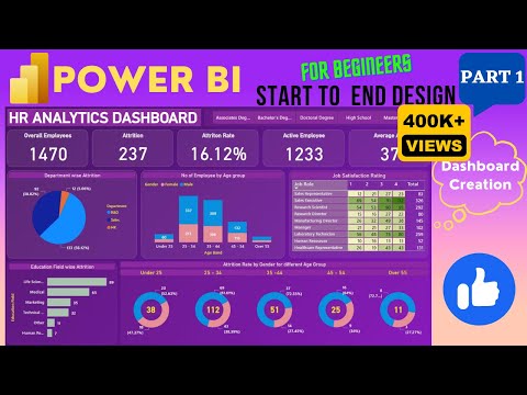
Excel Dashboard from start to end (Part 1) | HR Analytics Dashboard | Start to End Design
 0:07:29
HR Analytics and How to Get Started
 0:15:57
Data Analyst Project For Beginners (HR Analytics): 4 - Creating Metrics
 0:27:37
HR Data Analytics & Awesome Dashboard with Power BI 💡: End-to-End Project
 0:06:32
How To Create HR Report For Beginners | A Beginners Guide | HR Analytics
 1:00:38
HR Analytics and AI: Turning Data into Actionable People Insights
 0:14:29
How to Create HR Reports Using Excel [UPDATED] | HR Analytics in Excel
 0:03:47
What is HR Analytics? | AIHR Learning Bite
 0:36:44
Tableau Dashboard from Start to End (Part 1)| HR Dashboard | Beginner to Pro | Tableau Project
 1:14:40
HOW TO CREATE A STUNNING HR ANALYTICS DASHBOARD IN EXCEL
 0:05:43
How to Create Value through HR Analytics in Just 1 Week | AIHR Learning Bite
 0:33:54
Power BI for HR | How to Build an Interactive Dashboard & HR Data Analytics [2024]
 0:38:22
Power BI Dashboard from Start to End (Part 1)| HR Dashboard | Beginner to Pro | Power BI Project
 0:23:28
Create a HR Dashboard with Tableau - Full Tutorial
 0:02:45
Data Analyst Project For Beginners (HR Analytics): 1 - Problem Statement
 0:14:52
Create HR Dashboard using Excel
 0:23:53
How To Create An HR Dashboard in Excel | FREE HR Dashboard INCLUDED | HR Analytics in Excel
 0:30:02
Create IBM HR dashboard with Tableau in 30 minutes
 1:14:51
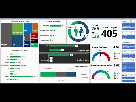
Build an interactive Human Resources Dashboard in Microsoft Excel - HR Dashboard
 0:36:27
HR Attrition and Head Count Analysis Dashboard in Excel | Complete Tutorial
 0:40:54
Excel Dashboard from start to end (Part 2) | HR Analytics Dashboard | Start to End Design #excel
Комментарии