filmov
tv
Creating Cohort Retention Pivot Charts with Python: Data Visualization Tutorial

Показать описание
This Python code is designed to create a cohort retention pivot chart using table data. It utilizes libraries such as pandas, matplotlib, and seaborn. The code first reads the data from the CSV file, processes it to format date values, and then pivots the data to create a matrix. It also defines a percentage formatter function to format retention rates. Finally, it generates a heatmap-style pivot chart visualizing cohort retention rates over time, with retention days on the y-axis and cohort months on the x-axis.
Full Description:
## How to Create a Cohort Retention Heatmap in Python with Pandas, Matplotlib, and Seaborn
In this tutorial, we walk through the steps to create a cohort retention heatmap using Python's powerful data analysis and visualization libraries: Pandas, Matplotlib, and Seaborn. Follow along to learn how to read and process your data, pivot it for visualization, and generate a clear, insightful heatmap to analyze user retention.
### Step-by-Step Guide:
1. **Setup and Data Import**: Learn how to set up your working directory and import the necessary libraries. We’ll show you how to load your cohort retention data from a CSV file using Pandas.
2. **Data Formatting**: Discover how to format and organize your data, ensuring it’s sorted by cohort month for better visualization. We’ll demonstrate how to convert dates and sort your DataFrame.
3. **Pivoting Data for Heatmap**: See how to pivot your data to create a matrix suitable for generating a heatmap. This step is crucial for visualizing the retention rates across different cohorts.
4. **Formatting Data for Readability**: Learn to apply a custom percentage formatter to your data, making the heatmap annotations more readable and professional.
5. **Creating the Heatmap**: Watch as we use Matplotlib and Seaborn to plot the heatmap. We’ll guide you through setting up the figure size, titles, and labels, and applying a color map to enhance your visualization.
### Code Breakdown:
```python
import pandas as pd
import seaborn as sns
import os
# Set paths
# Read and process data
# Define percentage formatter
def percentage_formatter(x):
return "{:.1f}%".format(x * 100)
# Pivot data for heatmap
index='retention_day',
columns='cohort_month',
values='retention_rate'
)
# Apply formatter
# Plot heatmap
```
### Keywords:
- Python cohort analysis
- Data visualization
- Heatmap tutorial
- Pandas data manipulation
- Matplotlib plotting
- Seaborn heatmap
- User retention analysis
By the end of this video, you'll have a solid understanding of how to visualize cohort retention data effectively. Don't forget to like, subscribe, and hit the notification bell for more tutorials on data analysis and visualization!
 0:04:14
Creating Cohort Retention Pivot Charts with Python: Data Visualization Tutorial
 0:05:20
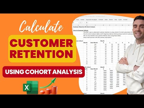
#Tableau - Calculate Customer Retention & Cohort Analysis
 0:16:17
Cohort Analysis on Customer Retention in Excel
 0:17:50
Customer Retention & Cohort Analysis | How VCs Calculate Customer Retention
 0:08:35
Creating a revenue retention chart from a transaction log
 0:02:21
12.8. Cohort analysis | Excel pivot tables COURSE
 0:05:29
Cohort Analysis in Excel
 0:04:15
Customer Retention Cohort Analysis
 0:10:53
What is Cohort Analysis? || Retention Rate || Data Analysis || Dynamic Array Formulas
 0:59:01
Exploring Data in SQL and Tableau | Cohort Retention Analysis | Data Analyst Projects | SQL Projects
 0:01:41
How to Perform Cohort Analysis in Excel 2016
 0:43:41
Cohort Analysis with Python from Scratch | Easy Code
 0:48:22
How to do cohort or retention analysis for e-commerce startup | Google sheets BigQuery SQL
 0:04:31
How to Use Customer Retention Cohorts for eCommerce
 0:05:02
Cohort Analysis Model - Tutorial
 0:24:00
How to create cohort analysis in Google Sheets? | Part 1 from 2 | Looke Studio by Gaille Reports
 0:10:48
Calculate Retention & Churn || Cohort Analysis || Data Analysis
 0:48:05
Customer Cohort And Retention Analysis: Weekly Cohort Analysis with Power BI
 0:14:47
cohort Study | Cohort Analysis in Excel |How to Calculate Customer Lifetime Value | #excel
 0:05:42
How to cohort a transaction log by customer acquisition date, and get repeat purchases and AOV
 0:16:37
Retention modeling in Excel
 0:05:28
Cohort Analysis in Looker Studio
 0:36:35
Preventing churn with retention analysis in Metabase
 0:02:42
Churn Analysis with Cohort Tables
Комментарии