filmov
tv
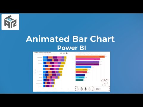
POWER BI - Animated Bar Chart

Показать описание
How to Create a Quick animated Chart with Power BI. Also discussed how to Deal with numerous Tables in Power Query editor to append all into one single Query .
Watch Learn and SUBSCRIBE
Watch Learn and SUBSCRIBE
 0:14:09
Power BI Animated Bar Chart Tutorial: Dynamic RAG Color Effects
 0:04:16
Microsoft Power BI | Create Animated Bar Chart Race | Visual in Power BI | Tutorialspoint
 0:08:37
Power BI Animated Bar Race Chart Tutorial
 0:02:37
How to Create Animated Bar Plot in Power BI?
 0:00:19
Formula 1 season 2021 Power BI Animated Bar Chart Race
 0:14:18
How to Create an Animated Power BI Dashboard with Moving Visuals (Bar charts, Cards, Tables & Ma...
 0:06:31
Create Animated Bar chart using Power BI
 0:00:19
Power BI Animated Dashboard
 0:07:55
How to Create Animated Bar Chart in Power BI using SVG DAX
 0:08:37
Power BI Animated Bar Race Chart Tutorial | Power BI Custom Charts | Power BI Advance Charts
 0:02:42
How To Create Animated Bar Chart Race In Power BI? - The Friendly Statistician
 0:12:06
How to ANIMATE CHARTS using the DYNAMIC PLAY AXIS custom visual // Beginners Guide to Power BI
 0:04:41
How to create animated bar chart race in power BI
 0:02:23
Create animated bar chart power bi
 0:00:25
Animated Bar Chart in Power BI
 0:00:33
Animated Bar Chart in Power BI
 0:03:42
Can we have ANIMATED Power BI visuals?
 0:01:43
Animated Bar Chart Race - Power BI
 0:01:20
How to create Animated Bar Chart Race in Power BI? | BI Structure
 0:02:17
📊 Power BI Animated Bar Chart | Step-by-Step Guide to Dynamic Data Storytelling 🚀| 1stepGrow Academy...
 0:05:41
7.1 How to add a Animated Bar Chart Race in Power BI | Power BI Tutorial for Beginners | Carl Huff
 0:04:04
POWER BI | Animated Bar Chart Race in Custom Visual
 0:00:50
Bring Your Data to Life! Animated Bar Chart Race in Power BI 📊🔥
 0:08:52
POWER BI - Animated Bar Chart
Комментарии