filmov
tv
Add Axes to Plot Using axis Function in R (4 Examples) | Modify Ticks & Labels | Change Text & Value

Показать описание
R code of this video:
plot(1:100) # Default plot
plot(1:100, # Plot without axes
xaxt = "n",
yaxt = "n")
axis(side = 1, # Draw x-axis
c(0, 25, 50, 75, 100))
axis(side = 2, # Draw y-axis
c(10, 50, 90))
plot(1:100, # Plot without axes
xaxt = "n",
yaxt = "n")
axis(side = 3, # Add axis on top
c(0, 25, 50, 75, 100))
axis(side = 4, # Add axis on right side
c(10, 50, 90))
plot(1:100, # Plot without axes and borders
axes = FALSE)
axis(side = 1, # Add x-axis
c(0, 25, 50, 75, 100))
axis(side = 2, # Add y-axis
c(10, 50, 90))
Follow me on Social Media:
 0:00:27
Axes options in Excel
 0:06:18
Add Axes to Plot Using axis Function in R (4 Examples) | Modify Ticks & Labels | Change Text &am...
 0:03:22
matplotlib Part 5 – Adding Axes to the Figure
 0:03:20
Add Secondary Axis in Excel Charts (in a few clicks)
 0:02:28
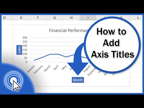
How to Add Axis Titles in Excel
 0:06:52
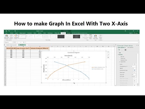
How To Plot an Excel Chart with Two X-Axes
 0:00:51
EXCEL How to use secondary axis in charts
 0:02:55
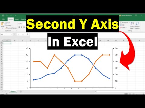
How To Add A Second Y Axis To Graphs In Excel
 0:31:32
Arduino Uno R4 WiFi LESSON 78: Plotting Acceleration Data on the Arduino Serial Plotter
 0:09:53
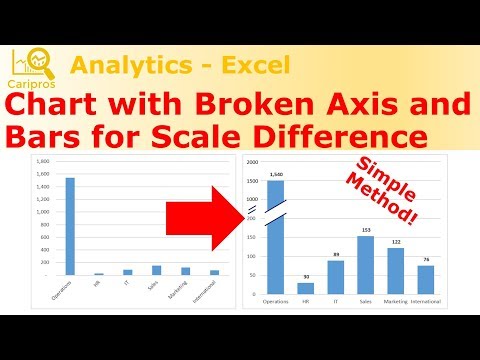
Create Chart with Broken Axis and Bars for Scale Difference - Simple Method
 0:00:39
How to Set X and Y Axis in Excel
 0:00:48
How to add axes to a figure object in matplotlib ?
 0:12:29
add_axes function in Matplotlib | How to add axes to Matplotlib figure | add_axes Matplotlib
 0:00:39
How to Add a Secondary Chart Axis in Excel
 0:00:15
Easy Way To Create And Add Data To Graph
 0:00:23
How to create an s-curve combo chart in #excel #exceltips #exceltricks
 0:01:43
How to Add X and Y Axis Labels in an Excel Graph
 0:04:08
Draw Plot with Actual Values as Axis Ticks & Labels in R (2 Examples) | Change Tick Marks of Axe...
 0:00:11
Add data to chart in excel #exceltips #exceltutorials #charts
 0:00:18
Draw a Multiple Bar Diagram in Excel
 0:08:05
How to make a chart with 3 y-axes using matplotlib in python
 0:00:15
adding titles and labels axes in plot function using R programming language
 0:06:47
How to make a chart with 3 axis in excel
 0:02:29
Add Reference Lines to graph axes based on statistics and expressions
Комментарии