filmov
tv
Create an XY Scatter Graph in Excel | Scatter Plot with Multiple Data Sets | Include Trendline

Показать описание
👍👍If you have found this content useful and want to show your appreciation, please use this link to buy me a beer 🍺.
Thank you! 👍👍
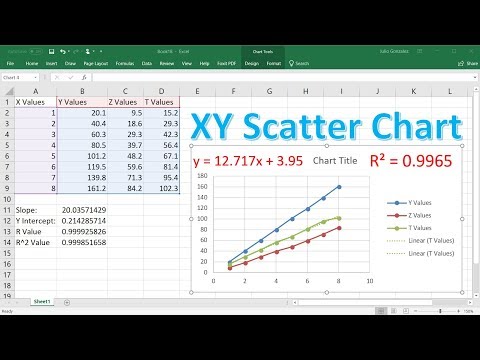
In this video, I demonstrate how to create an XY scatter graph in Excel. An X Y scatter plot is used to explore the relationship between data sets. In my example, I look at the relationship between a day's top temperature and sales of ice creams, burgers and pies.
I would expect ice cream sales to increase as the temperature increases, but is this true and is it true for burgers and pies? A scatter graph will clearly show whether there is a correlation.
I also show you how to add multiple series to a scatter graph. You can either show all series in one graph or in separate graphs. I will show you the most efficient method for achieving both outcomes!
Lastly, I also demonstrate how to include a trendline in your scatter graph and how to forecast forward or backward based on existing data. So for example we might want to forecast sales of ice creams with a top temperature of 40 degrees celcius (pretty unlikely in the UK!). In addition, I demonstrate how to use the FORECAST.LINEAR function which will give an exact value for the forecast.
------------------------
Thank you! 👍👍
In this video, I demonstrate how to create an XY scatter graph in Excel. An X Y scatter plot is used to explore the relationship between data sets. In my example, I look at the relationship between a day's top temperature and sales of ice creams, burgers and pies.
I would expect ice cream sales to increase as the temperature increases, but is this true and is it true for burgers and pies? A scatter graph will clearly show whether there is a correlation.
I also show you how to add multiple series to a scatter graph. You can either show all series in one graph or in separate graphs. I will show you the most efficient method for achieving both outcomes!
Lastly, I also demonstrate how to include a trendline in your scatter graph and how to forecast forward or backward based on existing data. So for example we might want to forecast sales of ice creams with a top temperature of 40 degrees celcius (pretty unlikely in the UK!). In addition, I demonstrate how to use the FORECAST.LINEAR function which will give an exact value for the forecast.
------------------------
 0:07:23
Create an XY Scatter Chart in Excel
 0:06:07
Creating an XY Scatter Plot in Excel
 0:13:24
How To Make a X Y Scatter Chart in Excel With Slope, Y Intercept & R Value
 0:00:54
Plotting an x-y Scatter Chart in Excel
 0:00:21
How To Create A Scatter Plot In Excel
 0:07:08
Making An X-Y Scatter Graph
 0:05:14
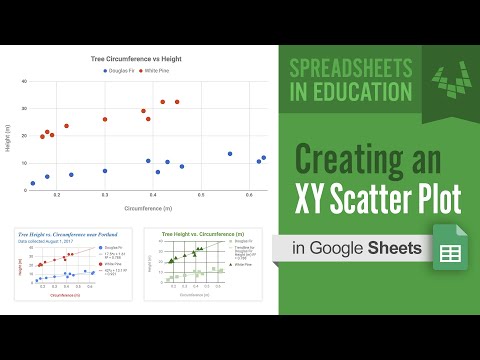
Creating an XY Scatter Plot in Google Sheets
 0:00:54
How to Make a Scatter Plot in Excel
 0:11:41
Create an XY Scatter Graph in Excel | Scatter Plot with Multiple Data Sets | Include Trendline
 0:04:42
How to Make a Scatter Plot in Excel
 0:07:01
How to Plot X vs Y Data Points in Excel | Scatter Plot in Excel With Two Columns or Variables
 0:09:04
Creating an XY Scatter Plot in Excel | Creating a Scatter Plot in Excel 2019 | Scatter plot excel
 0:00:52
Making an XY scatter graph in Excel
 0:01:49
Quickly Add a Series of Data to X Y Scatter Chart
 0:01:57
Plot Multiple Lines in Excel
 0:05:34
Create an X Y Scatter Chart
 0:02:36
How To Make A Line Graph In Excel-EASY Tutorial
 0:05:34
Creating an XY scatter graph
 0:01:28
How to Make a Graph on Excel With X & Y Coordinates | How to Make a Scatter Plot in Excel
 0:00:50
How to Create Categorical Scatterplots in Excel
 0:00:27
Axes options in Excel
 0:02:23
How To Create An XY Scatter Chart In Excel
 0:11:49
Using Office 365 Excel to make an XY Scatter Chart with a Power Law Fit
 0:12:29
Creating an XY Scatter Graph in Microsoft Excel
Комментарии