filmov
tv
Advanced Grids in UI & Web Design

Показать описание
In this video, I cover a variety of advanced grid techniques for web design, including responsive grids, 8-point grids, baseline grids, and more. By using these techniques, you can create web designs that not only look visually appealing, but also function efficiently. Whether you're just starting out in web design or are an experienced designer, this video has something to offer.
------------------------------------------------------------------------------------
🤝 //////////// Get my new Intro to UI/UX design course:
🏆 //////////// Join my members community to get access to perks:
📫 ////////// Sign up for my Monthly Newsletter
Get the file used for this video, support the creator
------------------------------------------------------------------------------------
🎨 ////////// I design in Figma
🖥️ ////////// I build websites with Webflow
📅 ////////// I run my life with Notion
 0:09:45
Advanced Grids in UI & Web Design
 0:16:23
Perfect Responsive Grid Systems Masterclass | UI Design & Figma Tutorial
 0:04:28
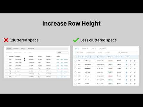
UI Design Tips for a Better Data Table UX
 0:11:59
Complete Layout Guide
 0:08:32
The Perfect Spacing Framework in UI Design | Figma Tutorial
 0:11:05
5 levels of UI skill. Only 4+ gets you hired.
 0:08:30
Misconceptions about UI Grids (Everything you need to know)
 0:04:32
Grid Systems in Web & UI Design
 0:00:40
Advanced filters for backoffice UI Design
 0:23:56
6 Advanced UI Design Tips (Deep-dive)
 0:09:25
8 Point Grid system - Improve your UI designs (Figma file included)
 0:20:46
Amateur vs Pro UI Design | with examples
 0:11:11
6 UI Hacks I Wish I Knew As A Beginner
 0:14:00
Poster Grids YOU MUST USE For Professional Results! | Poster Design Lesson
 0:03:12
Unreal-5: Flexible Dynamic UI & Anchor-Points (3 MINUTES!!)
 0:00:54
The 3 biggest issues in UI
 0:00:19
Roblox demo - Responsive UI design
 0:06:18
60-30-10 Color Rule
 0:11:10
Figma Tutorial: Setup a Responsive Grid Layout for UI & Web Design (IN 11 MINUTES)
 0:39:47
Advanced UI Templating Techniques using Widget Blueprints and Materials | Unreal Fest 2022
 0:06:53
world's shortest UI/UX design course
 0:00:33
How much does a UI/UX DESIGNER make?
 0:14:34
Effectively Use Column & Row Grids in UI Design (Figma)
 0:00:36
Using Atomic Design Principles for UI Inventory - Design Systems in Figma
Комментарии