filmov
tv
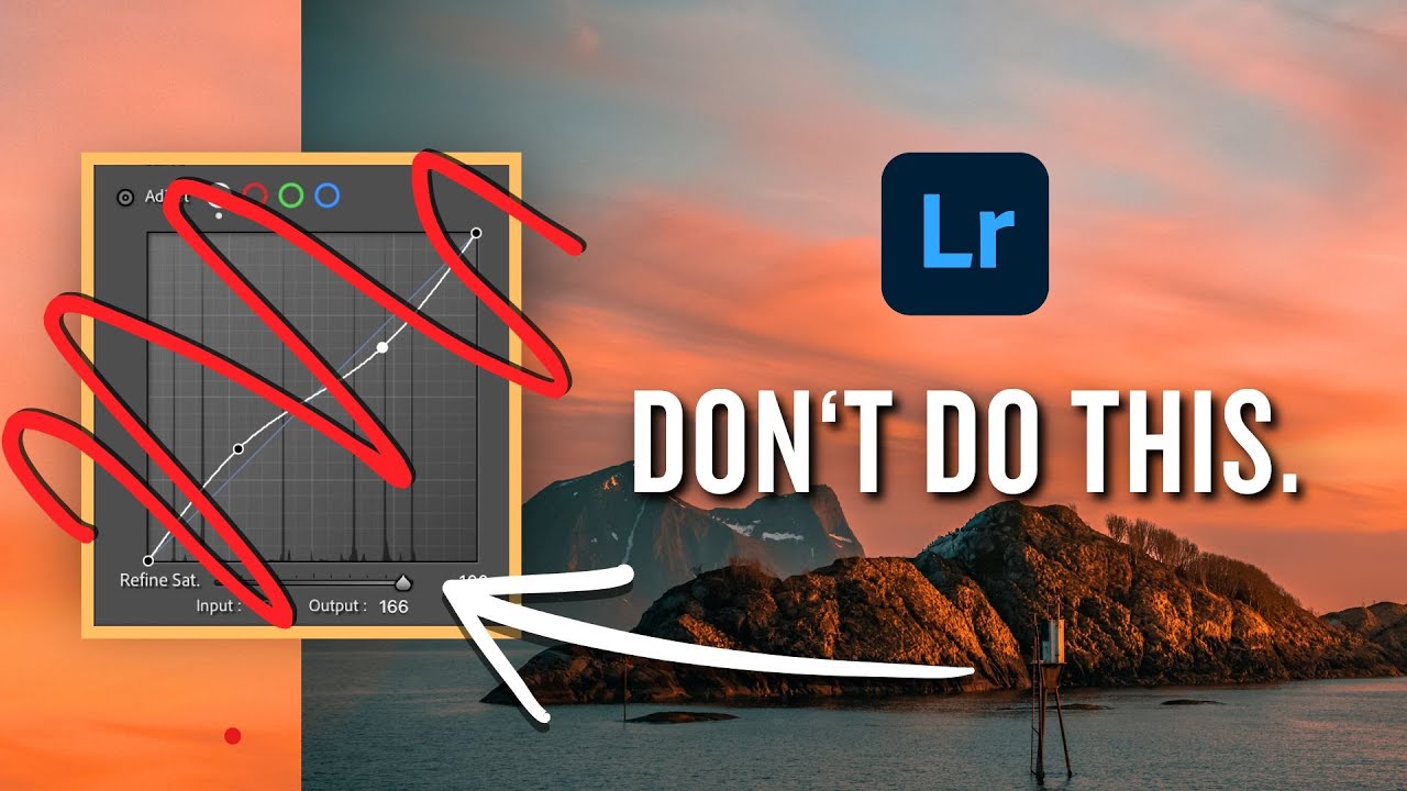
This CHANGED My Editing... Learn Lightroom Curves In 20 Minutes
Показать описание
Lightroom tone curves will finally MAKE SENSE after watching this video tutorial. Here's everything you need to know about how to use the tone curve tool panel in Lightroom CC & Lightroom Classic like a pro.
#LightroomTutorial #PhotoEditing #ToneCurvesExplained #photographytips
.
.
#newlightroom #photoediting #tonecurves
.
*LIGHTROOM PRESETS*
*PHOTO BUSINESS TEMPLATES*
*ALL ACCESS MEMBERSHIP*
.
And for anyone wondering...
And for anyone wondering...
📸 My camera gear:
🖥 Computer Editing Setup =
I'd recommend going with at least 512gb of storage.
TIMESTAMPS
0:00 Introduction to Tone Curves
Overview of the tutorial's goal to simplify and demystify the tone curve in Lightroom.
1:03 Understanding the Tone Curve Interface
Explanation of the different elements in the tone curve, including the two gray curves and RGB curves.
2:26 Adjusting Basic Tones
Demonstrating the impact of adjusting blacks, whites, shadows, and highlights on the overall image.
4:21 Precision with the Point Curve Tool
Introduction to the point curve tool for making specific adjustments to different parts of the image.
5:56 Recovering Contrast with Tone Curve
Comparing the tone curve's selective contrast adjustment with the global contrast settings.
7:44 Selective Corrections
Using the tone curve to selectively correct specific areas in an image without affecting the overall balance.
9:36 Tips and Tricks for Precision Editing
Providing tips on making precise adjustments using the option/ALT key, arrow keys, and avoiding overcorrection.
10:11 Real-Life Examples and Practice
Applying the concepts learned to real-life examples, encouraging viewers to practice with downloadable images.
13:30 Using red, green, and blue channels for selective color adjustments.
Adding color to different tones in the image.
S-Curve for Contrast
16:41 Creating an S-curve for contrast using the main tone curve.
Explaining the shape of the S-curve and its effect on contrast.
Color Grading with Tone Curve
17:08 Adding an orange and teal look using the red, green, and blue channels.
Achieving the effect without using color grading.
Advanced Skin Tone Correction
18:01 Correcting skin tones with the tone curve.
Creating a mask for selective adjustments.
Creating a Preset for Skin Tone
20:00 Turning the tone curve adjustments into a preset for quick application.
Demonstrating the application of the preset for skin tone.
Conclusion
20:23 Recap of the key features of the Lightrom tone curve.
 0:21:23
This CHANGED My Editing... Learn Lightroom Curves In 20 Minutes
 0:06:51
4 Editing Secrets Small Channels Learn Too Late
 0:00:31
Memories X Another Love (Sped up) || Chatting Lyrics Edit #shorts
 0:00:51
How to learn video editing #shorts
 0:06:37
This VIM trick BLEW MY MIND
 0:02:16
Learn to Use Graph Editor - Alight Motion Tutorial
 0:00:26
The BIGGEST change to my editing these days has been learning to use Macro commands. #premierepro
 0:00:59
Villains Are Not Born They Are Made || The Last Summoner || Sad Story || #anime #shorts
 0:00:21
DARK MODE in Outlook #bossyouroffice
 0:00:21
Learn My Secret for Editing Insanely Fast in Premiere Pro #shorts
 0:40:35
Free Video Editing Crash Course | Learn Video Editing in less than 1 Hour (Free Software)
 0:23:36
FREE Capcut Course ✅ Learn Video Editing in Capcut App 🤩 in Hindi
 1:10:23
How to Learn Video Editing?
 0:17:31
LEARN CAPCUT IN 15 MINUTES // COMPLETE MOBILE VIDEO EDITING TUTORIAL FOR BEGINNERS!
 0:00:15
My Pou transformed into a Monster! @diamondwow - Piano Duet
 0:00:46
Learn about the editing of THE LAST OF US! #edit #podcast #thelastofus
 0:00:58
Snapseed background black & white picture edit | learn this
 0:16:21
Learn To Edit Video In 15 Minutes
 0:01:01
Learn this FIRE Music Video editing effect in After Effects (Full Tutorial Pinned in Comments)
 0:13:52
Editing the eBook Learn Mode
 0:09:14
Are you wanting to improve your photo editing and learn Photoshop?
 0:08:43
This changed my photo editing forever | Professional Subject Separation lightroom Tutorial In Hindi
 0:51:55
Let's Learn Blender! #4: 3D Modelling in Edit Mode!: Part 1
 0:00:18
New vid/edit I'm learning how to edit but this is from cap cut I'm also changing my channe...
Комментарии