filmov
tv
Add Labels to Pie Chart in Tableau

Показать описание
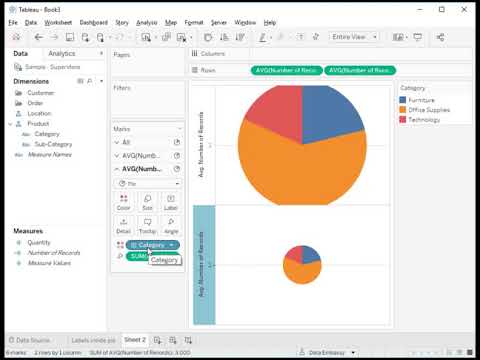
Boost your Tableau skills with our comprehensive tutorial on adding labels and percentage labels to pie charts! 🎨📊 Whether you're a data enthusiast, business analyst, or just getting started with Tableau, this session will enhance your ability to create informative and visually appealing pie charts. As a bonus, we'll also show you how to position these labels inside the chart for a polished and professional look. Perfect for making your data visualizations more insightful and engaging! 🚀✨
📧 Need Assistance?
What You'll Learn:
🔹 Building a Basic Pie Chart:
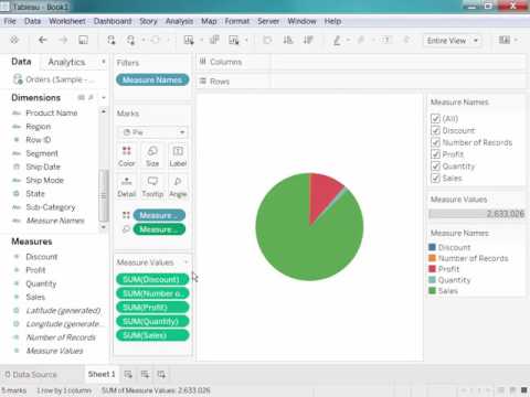
Step-by-step instructions on creating a pie chart by dragging Sales to Rows and Region to Columns.
Selecting the pie chart visualization and resizing it for better visibility. 🛠️📈
🔹 Adding Sales Labels:
How to duplicate the Sales field onto the Label shelf to display sales numbers on each slice.
Enhancing your chart with clear and readable sales labels. 🏷️💰
🔹 Incorporating Percentage Labels:
Using quick table calculations to add percentage of total labels alongside sales figures.
Moving the percentage calculation to the Label shelf for comprehensive data representation. 📊🔢
🔹 Creating Dual-Axis Pie Charts for Enhanced Label Placement:
Adding Max of Zeros to Rows and creating a dual-axis chart to position labels inside the pie slices.
Duplicating the Sales field, adjusting sizes, and hiding labels on the secondary axis for a clean look. 🔄🎯
🔹 Customizing and Finalizing Your Pie Chart:
Tips on sizing pie charts separately and hiding unnecessary labels to maintain a professional appearance.
Final touches to ensure your labels are perfectly positioned inside the chart for maximum impact. ✨🎨
🔹 Bonus: Positioning Labels Inside the Pie Chart:
Advanced techniques to place both sales and percentage labels neatly inside the pie slices.
Enhancing the readability and aesthetic appeal of your pie charts. 🌟🖼️
Why Learn This:
💡 Enhance Data Clarity:
Displaying both sales and percentage labels provides a clear and comprehensive view of your data, making it easier to interpret and analyze. 🧠📈
🚀 Boost Professionalism:
Well-labeled pie charts look polished and professional, perfect for business presentations and reports. Impress your audience with visually appealing and informative charts. 🏆✨
📊 Improve Data Storytelling:
Combining sales figures with percentage insights allows you to tell a more complete story with your data, highlighting key metrics and trends effectively. 📚🔍
👥 Increase Audience Engagement:
Interactive and well-designed charts capture attention and engage your audience, making your data presentations more impactful and memorable. 🤝🎯
🛠️ Expand Your Tableau Toolkit:
Mastering label customization techniques adds valuable skills to your Tableau repertoire, enabling you to create more dynamic and versatile visualizations. 🛠️📚
👍 Enjoyed the video?
Like and subscribe for more Tableau tutorials and data visualization tips! 🔔💬
📣 Stay Connected:
Follow us on our social media channels to stay updated with the latest tutorials and data insights! 🌐📱
Keywords: Tableau, pie chart labels, percentage labels, Tableau tutorial, data visualization, business intelligence, interactive training, data analytics, chart customization, professional reports, visualization enhancement, sales analysis, dual-axis chart, label placement, Power BI alternatives
#Tableau #PieChart #DataVisualization #TableauTutorial #BusinessIntelligence #InteractiveTraining #DataAnalytics #ChartCustomization #ProfessionalReports #VisualizationEnhancement #SalesAnalysis #DualAxisChart #LabelPlacement #DataStorytelling #TableauTraining #DataInsights #PowerBIAlternatives #TechTutorial #BusinessReports #DataPresentation
 0:05:39
 0:01:20
 0:03:35
 0:04:36
 0:01:23
 0:00:18
 0:00:20
 0:00:39
 1:12:08
 0:00:28
 0:05:01
 0:05:13
 0:01:32
 0:00:39
 0:00:17
 0:01:13
 0:05:13
 0:03:06
 0:00:10
 0:00:33
 0:00:39
 0:00:31
 0:00:48
 0:03:16