filmov
tv
How to Make Pareto Charts in Power BI | Step-By-Step Tutorial | Part 1

Показать описание
Creating a Pareto Chart in Power BI is not difficult and this video will show you step-by-step how to create one. You can then use this technique to apply the 80/20 rule in your own use case.
Power BI lets you create Pareto charts without the need for any other custom visuals. I'll walk you through the process of making a Pareto chart in Power BI using native visuals in this video, and in the next video, I will show you how to deal with ties or duplicate values when building a Pareto chart.
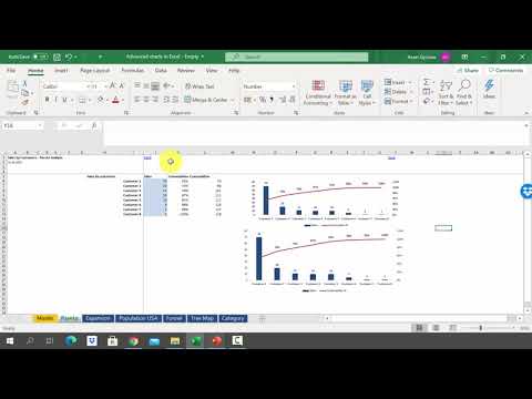
For this video, I created a dummy data set of guest complaints for a fictitious restaurant chain. We will use a Pareto chart and the 80/20 principle to plot and analyze our data and find out the top few vital issues that are responsible for the majority of the complaints.
⏲ Video Timestamps
----------------------------------------------------------------------------------
00:00 Introduction
00:50 Introduction to the Data Model
02:25 Building the Pareto % measure calculation
10:03 Applying conditional formatting
10:59 Adding a Pareto % parameter
14:10 Ending
----------------------------------------------------------------------------------
------------------------------------------------------------------------------------------------
👨🏫 For Instructor-led virtual training programs, visit:
------------------------------------------------------------------------------------------------
🟢 LET'S CONNECT!
------------------------------------------------------
✔ Mobile No: 00966509791858
#excelfort #powerbi #msexcel #powerquery #powerapps #data #powerbidesktop #powerbitraining #DAX
Power BI lets you create Pareto charts without the need for any other custom visuals. I'll walk you through the process of making a Pareto chart in Power BI using native visuals in this video, and in the next video, I will show you how to deal with ties or duplicate values when building a Pareto chart.
For this video, I created a dummy data set of guest complaints for a fictitious restaurant chain. We will use a Pareto chart and the 80/20 principle to plot and analyze our data and find out the top few vital issues that are responsible for the majority of the complaints.
⏲ Video Timestamps
----------------------------------------------------------------------------------
00:00 Introduction
00:50 Introduction to the Data Model
02:25 Building the Pareto % measure calculation
10:03 Applying conditional formatting
10:59 Adding a Pareto % parameter
14:10 Ending
----------------------------------------------------------------------------------
------------------------------------------------------------------------------------------------
👨🏫 For Instructor-led virtual training programs, visit:
------------------------------------------------------------------------------------------------
🟢 LET'S CONNECT!
------------------------------------------------------
✔ Mobile No: 00966509791858
#excelfort #powerbi #msexcel #powerquery #powerapps #data #powerbidesktop #powerbitraining #DAX
 0:06:16
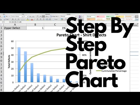
How to Create A Pareto Chart Like A Pro in Excel | Pareto Principle Example
 0:03:41
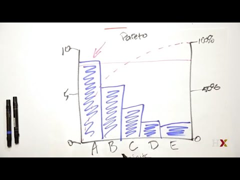
How to use a Pareto chart
 0:12:16
How to Make a Pareto Chart in Excel
 0:04:21
Pareto Chart in Excel | 80-20 Rule | Learn to create Pareto Chart
 0:14:00
Pareto Analysis (how to create a Pareto Chart, analyze results, and understand the 80 20 Rule)
 0:11:05
How to Create Pareto Chart in Excel | Problem Solving Tool (English)
 0:06:44
Pareto Charts (1 of 2: Rearranging the data)
 0:04:13
How to create a Pareto Chart in Excel - 80/20 Rule or Pareto Principle
 0:03:17
Mastering Excel Pareto Charts: A Step-by-Step Tutorial
 0:07:58
How to Make a Pareto Chart in MS Excel
 0:03:39
Introduction to Pareto Charts (Lean Six Sigma)
 0:06:40
The EASIEST way to make a Pareto Chart
 0:14:36
How to Make Pareto Charts in Power BI | Step-By-Step Tutorial | Part 1
 0:04:54
Quality Management: Pareto Chart
 0:08:34
How To... Create a Pareto Chart in Excel 2013
 0:05:27
Excel Pareto Charts: Creating Pareto Charts With Pivot Tables in Excel
 0:03:34
How to Create a Pareto Chart in Excel (80/20 Rule, Pareto Principle)- Excel Girl
 0:09:09
How to Draw Pareto Chart in Excel ! Pareto Principle ! 80/20 Rule ! ASK Mechnology !!!
 0:07:43
Learn how to make Pareto Charts in Power BI | Step-By-Step Tutorial form Basics | POWER BI DASHBOARD
 0:08:49
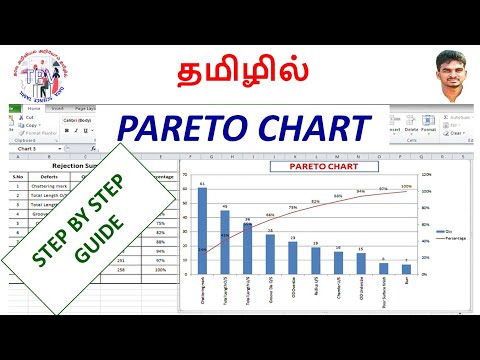
Pareto Chart in Tamil - Quick and manual methods to create Pareto Chart in Excei/Pareto chart excel
 0:03:02
Ho to create Pareto Chart in Excel
 0:00:41
How to Create a Pareto Chart
 0:00:39
How to create a Pareto Chart in Excel in 2 steps - Excel Pareto Chart Tutorial (Excel 2016/2019/365)
 0:13:03
Create a Pareto Chart with a Target Line
Комментарии