filmov
tv
Nasa's climate spiral

Показать описание
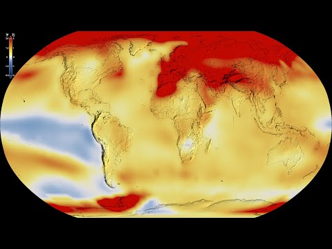
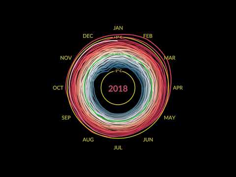
The visualization shows monthly global temperature anomalies (changes from an average) between the years 1880 and 2021. Whites and blues indicate cooler temperatures, while oranges and reds show warmer temperatures. The temperatures are based on data from NASA's Goddard Institute for Space Studies.
NASA Climate Spiral
Global Warming from 1880 to 2022
NASA Climate Spiral 1880-2022
Creating the NASA GISS animated climate spiral in R (CC220)
NASA Climate Spiral
NASA Climate Spiral 1880-Present
Visualizing Global Temperature Anomalies: NASA’s Climate Spiral 🌍🌡️
NASA's Climate Spiral: Visualizing Global Warming #nasa #shorts
What's Causing the Sudden Spike in Global Temperatures?
NASA animation of temperature data from 1880-2011
July 2023 Record High Global Temperatures
Global Warming Broken Down by Latitude Zone: 1880-2022 (Degrees Celsius)
Arctic Sea Ice Spiral
Global Warming from 1880 to 2021
NASA Tracked Excess Carbon Dioxide Emissions
Climate Change
GISTEMP Spiral Climate - NASA
NASA Scientist Protest Arrested
NASA: Global Temperature Increase from 1880 to 2023
How NASA Scientists Measure Global Temperatures
Wie die Erde wärmer wird - Climate Spirals
startling nasa visualization of climate anomalies from 1880-2022
Nasa video shows how Earth has got warmer since 1880
#Summer #2023 was the #Hottest in #NASA's 144-year Record #Shorts
Комментарии
 0:00:31
 0:00:30
 0:00:31
 0:25:42
 0:00:31
 0:00:31
 0:00:31
 0:00:34
 0:00:14
 0:00:26
 0:00:31
 0:00:31
 0:00:31
 0:00:31
 0:00:20
 0:00:31
 0:01:10
 0:00:16
 0:00:30
 0:00:41
 0:00:33
 0:01:00
 0:00:38
 0:00:31