filmov
tv
Jurassic Park Blu-ray Comparison [2011 vs 2013 Transfer]
Показать описание
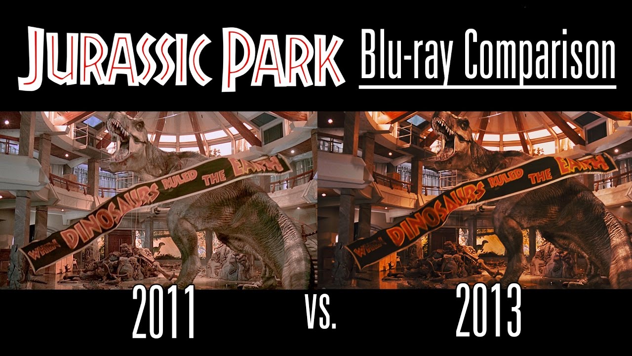
This is a comparison between the 2011 blu-ray transfer of JURASSIC PARK and the 2013 3D edition transfer. It should give you a better idea of what exactly was changed, which was more than just the colour grade.
Please take into account the effect YouTube's encoding has on the quality of the footage. This isn't true 1:1 blu-ray quality (though that is what I used while editing) but it still shows the differences pretty well.
Another thing to note is that the stretching of certain objects in the 2013 transfer is down to how the film was converted to 3D, they needed to amplify the distances between the foreground/background elements so effectively 'cut out' objects and moved them closer to the camera. This looks fine in 3D, but this is a comparison between the 2D version so I felt like I should still point it out.
TL;DW: They both look pretty good.
 0:07:36
Jurassic Park Blu-ray Comparison [2011 vs 2013 Transfer]
 0:01:45
Jurassic Park - 4k/Blu-ray Comparison
 0:10:04
Jurassic Park 4K vs Blu-ray Comparison (HDR version)
 0:04:27
▶ Comparison of The Lost World 4K HDR10 Mode vs The Lost World 2011 Blu-Ray Edition
 0:09:59
4K UHD vs. Blu-Ray Disc | A Jurassic Park Comparison
 0:10:01
JURASSIC Park 4K HDR vs Blu-Ray 1080p
 0:10:26
Jurassic World Blu-ray vs 4K Blu-ray Comparison (SDR version)
 0:03:36
JURASSIC PARK 4K Bluray Review | Jurassic Park Collection 4K
 0:10:04
The Lost World Jurassic Park HDR vs SDR Comparison (HDR version)
 0:17:54
Jurassic Park Ultimate Trilogy Boxset + Jurassic World Blu-Ray Movie Reviews
 0:08:00
Jurassic Park | Ultimate Trilogy | Limited Tin Box (Blu-ray, Region Free, United Kingdom)
 0:02:49
Jurassic Park (1993) 4K Blu-ray VS 35mm Film Scan
 0:11:02
Jurassic Park 4K UHD Blu-ray Review
 0:04:49
'Jurassic Park' video comparison | VHS - LaserDisc - DVD - Blu-ray
 0:05:36
Jurassic Park Trilogy Blu-ray Review from Haunted Flower
 0:07:14
Jurassic Park Blu-Ray Impressions
 0:08:01
Jurassic Park Ultimate Trilogy Blu-Ray Review and Unboxing (Best Buy Exclusive Steelbook)
 0:03:09
Jurassic Park Complete Collection 4K BLU RAY REVIEWS + Unboxing
 0:03:52
Jurassic Park Blu Ray Update - Remastered in 7.1 Surround Sound
 0:00:45
Jurassic Park (2011/2013 Blu-Ray)
 0:00:16
Blu-ray Jurassic Park
 0:10:04
Jurassic World: Fallen Kingdom Blu-ray vs 4K Blu-ray Comparison (SDR version)
 0:11:15
JURASSIC PARK: HOME VIDEO HISTORY
 0:07:45
Jurassic Park 4k BluRay Review
Комментарии