filmov
tv
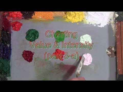
Quick Tip 229 - Charting Value and Intensity p3-a

Показать описание
Increasing the degree of difficulty artist/art teacher Dianne Mize charts the value and intensity of red and green.
 0:20:25
Quick Tip 229 - Charting Value and Intensity p3-a
 0:36:58
Quick Tip 230 - Charting Value and Intensity p3-b
 0:31:14
Quick Tip 228 - Charting Value and Intensity p2-b
 0:16:21
Quick Tip 225 - Charting Value and Intensity p1-a
 0:23:15
Quick Tip 227 - Charting Value and Intensity p2-a
 0:19:30
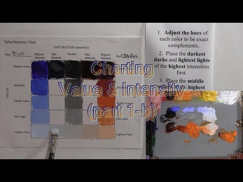
Quick Tip 226 - Charting Value and Intensity p1-b
 0:09:48
229$ Bone Conductor IEM? 🤔 Apevoix Grit, A New Discovery.
 0:00:31
Best Trick for the Table of 7 | Arti ki Maths Trick | Vedic #Maths #shorts
 0:00:47
Find your life purpose through your name and birthday! [numerology]
 0:00:12
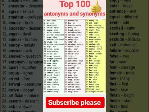
Top 100 antonyms and synonyms####
 0:02:50
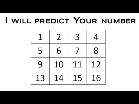
I Will Predict Your Number - Math Magic Trick
 0:00:51
Expanding Brackets
 0:09:00
How to Brief an Approach Plate | Our Best IFR Briefing Tips | IFR Approaches Made Easy
 0:12:20
Quick Tip 234 - Tonalism
 0:13:18
5 things to check & tune to 3D print faster
 0:00:42
LAWS OF EXPONENTS | MATHS TRICKS
 0:09:28
Procedure Turns Explained | Barbs and Hold-In-Lieu of
 0:07:51
Enroute Chart Airspace Explained | Compulsory Reporting Points
 0:14:27
Quick Tip 239 - Using the Prospek
 0:00:37
Bird drawing for beginners 🐦 bird drawing from number 22
 0:09:00
Ep. 229: How to FLY an ILS to Minimums | RWY 14 SRQ
 0:39:59
Complete Guide To Video Game Fishing | Sonar, Tackle, and Areas Explained
 0:04:05
The Best Time to Check Blood Glucose After a Meal | Dietitian Q&A | EatingWell
 0:08:17
How Good Are Your Eyes? Cool and Quick Test
Комментарии