filmov
tv
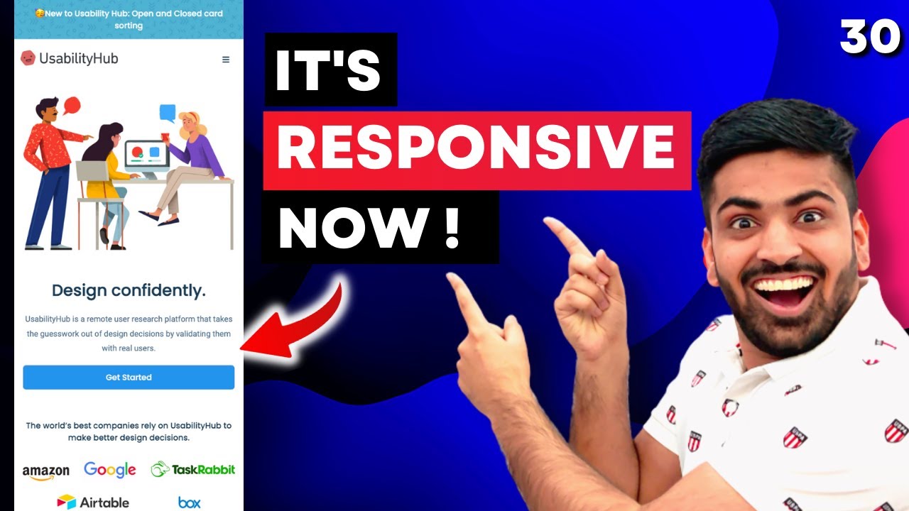
Completely Responsive Website using HTML + CSS Only in One Video 🔥
Показать описание
Hey guys, In this video, We will build the responsive version of our Website Clone.
Pre-requisites:
Timestamp:
0:00 Introduction
2:52 Tablet Version - 1st breakpoint
17:45 Large Mobile Version - 2nd breakpoint
29:35 Medium Mobile Version - 3rd breakpoint
🥳 Join our Telegram Community:
🚀 Follow me on:
Hashtags:
#codingshuttle #webdevelopment
Ignore these tags:
responsive website using html and css
coding shuttle
responsive web design
responsive website
anuj bhaiya web development
how to make responsive website in html and css
html css responsive website
how to make website responsive for all devices
media query in css
anuj bhaiya
how to make a responsive website using html and css
website using html and css
html css project
how to make responsive website
responsive website using html css and javascript
how to create responsive website in html and css
responsive
how to responsive website in css
responsive website html css
how to make website responsive
make responsive website html css
create a responsive website using html and css
website responsive html css
how to create a responsive website using html and css
how to make a website responsive for all devices
code shuttle
css
html css
responsive navbar html css
css responsive
media queries responsive web design
how to make website responsive using html and css
web development anuj bhaiya
complete responsive website using html and css
mobile responsive website html css
how to make a website responsive
html and css responsive website
html css website
responsive web design tutorial
css responsive design tutorial
html and css projects
css in one video
how to make any website responsive
responsive html css website
making responsive website using html and css
website using html css and javascript
html
website ko responsive kaise banaye
how to make your website responsive
anuj bhaiya web development course
create a website using html and css
how to make a responsive website
how to make website using html and css
project using html and css
responsive css
css media queries
full responsive website html css
how to use media queries in css for responsive design
responsive navbar
css tutorial for beginners
make website responsive
responsive design
landing page html css
media query
responsive css tutorial
responsive website tutorial
html and css website
making a responsive website using html and css
media query for responsive
responsive html css
simple responsive website using html and css
css full course
fully responsive website html css
html and css
html css projects for beginners
make a responsive website html css
responsive portfolio website html css
responsive website design
web development
website design
coding shuttle anuj sharma
css media queries responsive design
how to make a website using html and css
html responsive website
responsive website using bootstrap
responsive website using html and css and javascript
website responsive
website using html css
css project
make website using html and css
portfolio website
responsive header html css
web development full course
how to create a website using html and css
how to create responsive website
html and css project
html css responsive website design tutorial
responsive website using html and css bootstrap
simple website using html and css
using html and css to create website
website html css
bootstrap tutorial for beginners
build a website using html and css
coding shuttle web development course
css playlist
css tutorial
how to add responsiveness to a website
how to make a website responsive using html and css
how to make responsive navigation bar in html and css
html and css projects for practice
html and css tutorial for beginners
html css responsive website project
html full course
javascript
javascript project
project html css
responsiveness in css
 0:21:17
17: How to Make a Website Responsive | Learn HTML and CSS | Full Course For Beginners
 0:09:44
Master Media Queries And Responsive CSS Web Design Like a Chameleon!
 0:08:18
How To Make Website Responsive Using CSS Media Queries | Responsive Web Design Tutorial
 0:23:13
A practical guide to responsive web design
 0:20:19
24 | MAKE A WEBSITE RESPONSIVE FOR ALL DEVICES | 2023 | Learn HTML and CSS Full Course for Beginners
 0:38:27
Complete Responsive Website Using HTML CSS | Responsive web design tutorial
 0:15:54
5 simple tips to making responsive layouts the easy way
 0:25:27
Responsive Website Using HTML And CSS Step By Step
 0:22:58
P-5 Responsive E-Commerce Website using HTML, CSS, and JavaScript | JAVASCRIPT PROJECT #javascript
 1:25:35
🌐 Responsive Web Development: Building Websites for All Devices! 📱💻🖥️
 4:14:08
Introduction To Responsive Web Design - HTML & CSS Tutorial
 0:05:02
HTML CSS Fully Responsive Holy Grail Layout || Web Development
 0:14:52
How To Make Responsive Website Using HTML & CSS Only | Step-By-Step Tutorial | PRAROZ
 1:21:44
How To Make Website Using HTML CSS | Create Complete Responsive Website Step by Step
 0:19:16
How To Make Responsive Website Design Using HTML And CSS Step By Step
 1:25:42
HTML CSS and Javascript Website Design Tutorial - Beginner Project Fully Responsive
 0:04:28
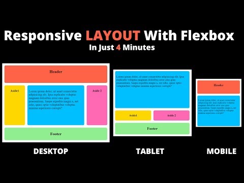
Responsive Flexbox Layout Page in 4 Minutes | Flexbox Tutorial
 0:42:54
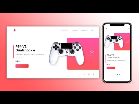
Completely Responsive Website using HTML + CSS Only in One Video 🔥
 1:11:59
How To Make Website Using HTML & CSS | Full Responsive Multi Page Website Design Step by Step
 0:41:22
How To Create Responsive Website Using HTML CSS And JavaScript Step By Step Tutorial
 0:47:37
Complete Responsive Website Using HTML CSS | Responsive Travel & Tour Website Design Tutorial
 0:08:00
How to Create Responsive Navigation Bar using HTML and CSS
 2:02:22
Build a Responsive Website | HTML, CSS Grid, Flexbox & More
 2:00:14
How To Make A Portfolio Website Using HTML CSS JS | Complete Responsive Website Design
Комментарии