filmov
tv
Excel Dot Map Charts - Yes, this is Excel!

Показать описание
Interactive dot map charts are not built into Excel, but with some creative use of Excel’s built in tools we can create something unique.
0:00 How to build dot map charts in Excel
0:20 Preparing the Chart Data
1:09 Dot Map Image
1:58 Scatter Chart
7:00 Custom Data Labels
9:53 Highlight Max Region
12:25 Interactive Slicer
13:59 Dynamically Updating the Chart
14:36 File Download Link
0:00 How to build dot map charts in Excel
0:20 Preparing the Chart Data
1:09 Dot Map Image
1:58 Scatter Chart
7:00 Custom Data Labels
9:53 Highlight Max Region
12:25 Interactive Slicer
13:59 Dynamically Updating the Chart
14:36 File Download Link
 0:14:59
Excel Dot Map Charts - Yes, this is Excel!
 0:12:53
🌍 How to make interactive Excel Map charts
 0:17:34
How to Create a DYNAMIC Map Chart With Drop-Down (works with ANY Excel version)
 0:06:55
Create a Map Chart in Excel
 0:07:23
Dynamic filtered range on a map in excel
 0:00:50
Create a Map from Excel Spreadsheet Locations
 0:11:02
How To Create a Map Chart in Excel
 0:00:26
How to create Map Charts in Excel? | Excel Tricks #shorts #excel
 0:04:27
How to make a map in excel with latitude and longitude co-ordinates
 0:38:12
Financial Statistics Dashboards System | Dynamic Excel Map Chart | Tutorial 2
 0:00:26
How to show 2 measures on the map? Example for Excel Map France
 0:10:44
Easy Way To Plot Cities on a Map Using Excel
 0:11:22
002. Build an Interactive Map with Charts in 10 min! | EXCEL
 0:09:35
Elevate Your Charts: Excel Map Visualization!
 0:06:59
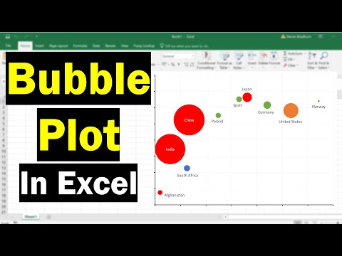
How To Create A Bubble Plot In Excel (With Labels!)
 0:03:45
Excel Chart Maps used with the Geography Data Type
 0:00:30
Maps Chart in excel #excel #tutorial #charts
 0:07:46
EXCEL Tutorial: Introduction to Dynamic Chart Map
 0:01:15
Excel E-Maps | How to plot address data on the map
 0:12:27
Interactive Excel Dot Plot Charts Make Sense of Many Series
 0:03:40
World map scatter and bubble chart in Excel
 0:03:00
Creating a Map Visualization in Excel 2013 PowerView
 0:08:46
Convert Excel Data into a Google Map
 0:06:45
🗺️Create a DYNAMIC Map Chart in Excel – Data Validation, UNIQUE, SORT and FILTER☝️
Комментарии