filmov
tv
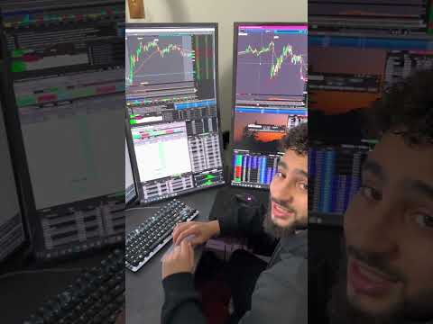
Build a Python Trading Dashboard From Simulated Data to Plotly and Dash

Показать описание
Ever wanted to visualize complex trading analysis like PCA and K-Means results in an interactive dashboard? This video shows you how, even WITHOUT the original data!
We'll focus on the *visualization and dashboarding* part, assuming you've already done the heavy lifting (data collection, feature engineering, PCA, K-Means).
What you'll learn:
► **Simulating Realistic Trading Data:** Creating synthetic price series with volatility regimes and transition signals in Python.
► **Calculating Key Metrics:** Generating necessary data points for plotting (e.g., post-transition returns, autocorrelation) directly from our simulated data.
► **Stunning Plotly Visualizations:** Crafting the three specific plots you need to showcase your analysis.
► **Interactive Dash by Plotly:** Building a web-based dashboard to bring all your visualizations together.
This is a practical guide to creating powerful financial dashboards when you need to demonstrate insights from complex models (like PCA/K-Means for regime detection). We'll make specific assumptions to simulate data that mimics typical market behavior.
**Code Focus:** Python, Plotly, Dash.
**Inspired By:** Advanced data analysis techniques like PCA and K-Means for market regime identification.
Get your free C++ HFT EBook here
#PythonDashboard #PlotlyDash #TradingAnalysis #DataSimulation #FinancialVisualization #PCA #KMeans #PythonForFinance
 0:05:48
 0:08:06
 0:01:04
 0:22:34
 0:38:15
 0:00:16
 0:09:05
 0:22:25
 0:32:35
 0:00:33
 0:56:11
 0:35:24
 0:00:17
 0:00:28
 0:00:29
 0:08:55
 0:45:35
 0:00:31
 0:57:53
 0:00:16
 0:10:44
 0:00:28
 0:00:48
 0:02:13