filmov
tv
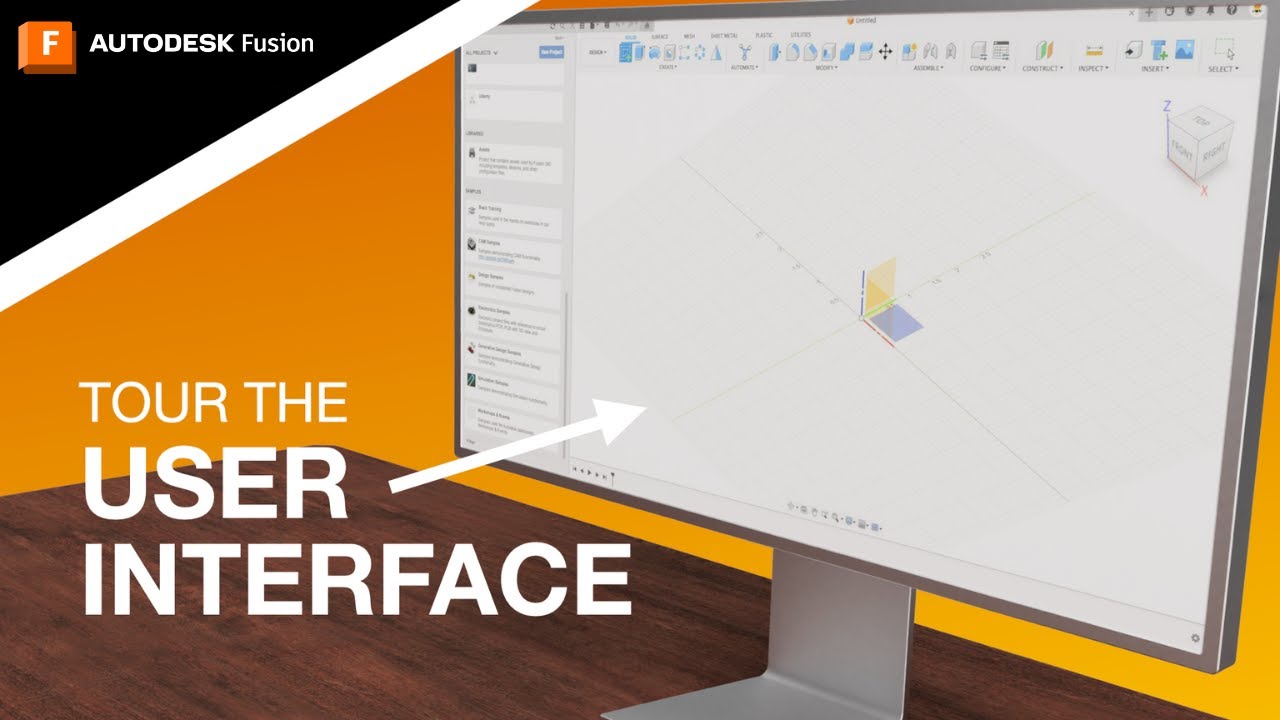
Navigate the Autodesk Fusion Interface Like a Pro! [UPDATED!!]

Показать описание
00:00 - Welcome to the video!
00:30 - Why learn the user interface?
01:09 - Data Panel
01:25 - Application Bar
02:45 - Toolbar
03:42 - Browser
04:02 - Canvas
04:22 - ViewCube
04:56 - Marking Menu
05:10 - Navigation Bar
05:27 - Timeline
05:47 - Thanks for watching!
CONNECT with Fusion 360 on social media:
Navigate the Autodesk Fusion Interface Like a Pro! [UPDATED!!]
How to Navigate the Autodesk Fusion 360 User Interface (sections explained)
Autodesk Fusion 360 Tutorial | Navigating the User Interface
Navigating the Fusion 360 User Interface (sections explained) - REVISED 2019
Set Pan, Zoom, & Orbit Controls | Autodesk Fusion 360
The Autodesk Fusion 360 Interface
Understanding Navigation and Preferences in Autodesk Fusion
Fusion 360 User Interface Tutorial | 2024 Interface
#3 Autodesk Fusion 360 tutorial ( beginner ) : How to Navigate in Fusion ( Zoom, Pan, Rotate )
Tutorial 1:Autodesk Fusion 360 interface tutorial
Day 1 of Learn Fusion 360 in 30 Days for Complete Beginners! - 2023 EDITION
Introduction to Autodesk Fusion 360 User Interface #autodesk #fusion360tutorial
Procad Tutorial: Autodesk Fusion 360 User Interface
Fusion 360 User Interface Customization and Preferences
Autodesk Fusion 360 User interface | EX 1 | Learn Fusion 360 Beginners Series, step by step tutorial
Autodesk Fusion 360 - Navigation
QUICK TIP: Data Panel Navigation
OpenBOM for Autodesk Fusion 360 - explaining user interface and controls
Navigating A360 in Fusion 360
'Fusion 360 Tutorial: Interface 'fusion 360,autodesk fusion 360,
Principles of Design Tutorial 1: Autodesk Fusion 360 Interface
How To Get Started With Fusion 360
Getting Started with Fusion 360 Part 1 - BEGINNERS START HERE!
Autodesk Fusion 360 Orientation
Комментарии
 0:06:14
 0:03:35
 0:03:12
 0:08:48
 0:03:14
 0:36:23
 0:10:22
 0:05:19
 0:01:49
 0:10:52
 0:13:07
 0:04:41
 0:03:35
 0:07:46
 0:05:30
 0:02:32
 0:02:31
 0:01:56
 0:06:50
 0:07:46
 0:13:46
 0:59:55
 0:21:32
 0:12:20