filmov
tv
How To Make ANY Graphic Design Instantly Better [Redesign Process]

Показать описание
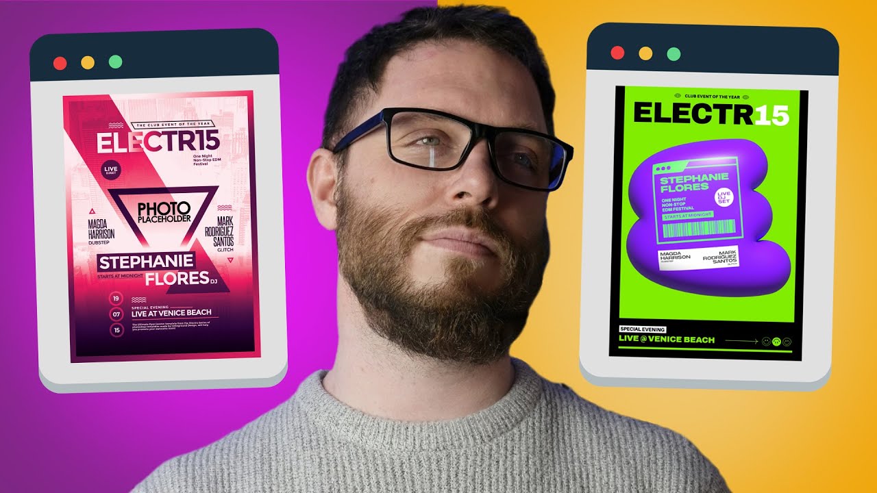
I attempt to take a BAD design downloaded straight from Freepik, and then redesign and reva,p it so it actually fits the target audience, all using the graphic design principles.
This redesign video was shot in real time, as I made changes to an existing poster design template from Freepik. I aimed to make the design a whole lot better by considering graphic design principles, and then also take into consideration the target audience of this poster. But do you think I improved on the redesign, or do you prefer the original?
If you found todays video on redesigning a poster from Freepik enjoyable or useful, let me know in the comments section and drop a like on your way out. Subscribe to stay updated to all of my uploads and until next time, design your future today, peace ✌️
Satori Graphics®
📌📌📌📌📌📌📌📌📌📌📌📌📌📌📌📌📌📌📌📌
The above links are affiliate links, most of which I personally use on a daily basis 👍
📌📌📌📌📌📌📌📌📌📌📌📌📌📌📌📌📌📌📌📌
⏯️ PLAYLISTS
********************************************************************
🐦 Join Me On Twitter!
📸 Here's My Instagram!
********************************************************************
©️ Copyright
The work is protected by copyright, produced by Satori Graphics®
This is applied to the video recording of itself as well as all artistic aspects including special protection on the final outcome. Legal steps will have to be taken if copyright is breeched. Music is used from the YouTube audio library and or sourced with permission from the author
0:00 The Redesign Challenge
0:16 Setting Up The Canvas
1:40 Creating Graphic #1
6:40 3D Inspiration
7:15 Starting The 3D Focal Point
10:35 Lighting Effects
11:11 Animate Vectors
13:54 Applying Graphics Onto The 3D Shape
14:47 Creating The 2nd Graphic
17:12 Applying Graphic #2
17:53 Bringing Everything Into Photoshop
24:46 Lighting & Blend Modes
27:40 Final Thought
Комментарии
 0:08:15
 0:08:02
 0:28:29
 0:05:42
 0:00:10
 0:06:03
 0:00:04
 0:17:13
 0:06:41
 0:14:22
 0:00:41
 0:02:47
 0:05:17
 0:08:08
 0:16:37
 0:06:53
 0:03:49
 0:00:26
 0:04:38
 0:00:59
 0:00:07
 0:00:39
 0:09:50
 0:04:41