filmov
tv
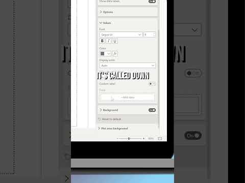
Create MEANINGFUL data labels with measures in Power BI

Показать описание
Tired of the usual text data labels that only have one value? Looking for something different? Patrick shows you how to customize your data labels using DAX in your Power BI reports!
*******************
Want to take your Power BI skills to the next level? We have training courses available to help you with your journey.
*******************
LET'S CONNECT!
*******************
***Gear***
#PowerBI #DAX #GuyInACube
*******************
Want to take your Power BI skills to the next level? We have training courses available to help you with your journey.
*******************
LET'S CONNECT!
*******************
***Gear***
#PowerBI #DAX #GuyInACube
 0:04:10
Create MEANINGFUL data labels with measures in Power BI
 0:18:45
From Boring to BRILLIANT: How CUSTOM LABELS in Power BI Will Make Your REPORTS Shine
 0:08:11
New Dynamic Formatting with DAX Power | Text data Labels with dynamic icons in power BI visuals ✨
 0:14:58
100% Control of Data Labels in Power BI
 0:08:05
Create a Measure and use that as a Data Label in your visuals in Power BI | MiTutorials
 0:14:42
#powerbitutorial Power BI- Measure driven data labels| How to use a different measure on label
 0:15:49
How to Customise ANY Data Labels using DYNAMIC FORMAT STRINGS // Beginners Guide to Power BI in 2023
 0:00:58
📊🔖 Finally CUSTOM LABELS arrived in Power BI! 🚀🌟 #PowerBI #design #shorts
 0:56:09
Four Steps to Deploy Microsoft Purview
 0:06:45
Leveraging Custom Labels in Power BI
 0:06:29
Magic of Dynamic Data Label and Error Bars in Power BI | Create Next Level Line Charts in Power BI
 0:41:06
How to create meaningful, memorable, instantly understandable data visualizations
 0:00:25
Adding Custom Data Labels in Power BI
 0:00:25
Specific and meaningful labels instead of generic labels leads to a richer language representation
 0:04:54
Show TOP N DATA LABELS in any Chart in Power BI
 0:02:49
Series labels in a Line chart in Power BI
 0:05:48
Custom Data Labels, Curved Lines, and Leader Line Labels (OH MY!)
 0:41:23
How Babble Labble Builds Data Labels from Natural Language
 0:04:03
QT#89 - Adding Conditional Formatting Icons to Data Labels on Power BI Visuals
 0:03:00
Create dynamic labels in Power BI using DAX
 0:12:23
Transform Boring Data into Meaningful Information - Pivot Charts
 0:32:31
Talk Data to Me: Beefing up Vizzes with Titles, Labels and Tooltips
 0:06:26
DAX Fridays! #184: Show last label only on a line chart in Power BI
 0:11:02
SAS Programming Tutorials | Titles and Footnotes | SAS Labels to Enhance Your Data | Class - 9
Комментарии