filmov
tv
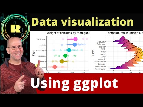
R Tutorial: Filtering and plotting the data

Показать описание
---
Good job preprocessing the data. This task often takes a lot of time, but here you are lucky to work with data that is already in a clean and tidy format.
In the remainder of this chapter, you are going to further explore the relationship between weekly working hours and hourly compensation, and the scatter plot is a good visual exploration form to do this.
Before visualizing this relationship, you will need to use dplyr's filter function to retain only European countries in the data set.
That's a good set of countries where data for both 1996 and 2006 are available – the years you are going to compare in the second chapter of this course. You already know how to use the filter function, as shown in the code example here, where only Switzerland is retained.
However, you might not know the so-called %in% operator, which often makes queries easier. While the equality operator in the previous example can filter for only one value at a time, the %in% operator can look up multiple values, like in this example.
Here, we filter for countries in the vector on the right-hand side of the %in% operator, which is actually equivalent to using the OR operator with multiple equality operators.
So in the following exercise, you are going to use this new %in% operator to only retain European countries in the data set.
Let's look at both labour market indicators. With ggplot2, we can quickly create a histogram of both the weekly working hours variable and the hourly compensation variable. This shows us the distribution of these values in 2006.
However, in order to see the relationship between both variables, we need to use ggplot's point geometry.
And this is what you're going to do in the following exercises: You're going to create the scatter plot shown here, using ggplot's geom_point function.
Still, without proper titles and labels, the plot is pretty worthless.
In a follow-up exercise, you are going to use ggplot's labs function to provide more information to the readers of your plot.
You're also going to quickly repeat some dplyr functions like group_by and summarize, as shown in this example here, where we computed the median weekly working hours over all years, for every country.
The result of this is a table which you are going to style in the later parts of this course, where you will compile a nice report of your findings.
Now it's your turn.
#DataCamp #RTutorial #Communicating #Data #Tidyverse #Filtering #plotting
 0:02:45
 0:26:51
 0:13:19
 0:27:31
 2:10:39
 0:18:11
 0:04:27
 0:59:48
 0:14:13
 0:05:36
 0:06:10
 1:23:22
 0:10:18
 0:18:28
 0:29:59
 0:05:16
 0:06:09
 0:01:59
 0:00:17
 0:11:29
 0:25:39
 0:01:13
 0:03:39
 0:10:30