filmov
tv
Excel Dashboard Course #12 - Creating the Right Excel Chart

Показать описание
In this video, I will show you to figure out what chart to use when creating dashboards and reports in Excel.
The video covers the following topics:
-- Show trends using charts
-- Axis Label management
-- Comparative trending
-- Performance against a target charts (Actual Vs Target charts)
#Excel #ExcelTips #ExcelTutorial
The video covers the following topics:
-- Show trends using charts
-- Axis Label management
-- Comparative trending
-- Performance against a target charts (Actual Vs Target charts)
#Excel #ExcelTips #ExcelTutorial
 0:17:54
Excel Dashboard Course #12 - Creating the Right Excel Chart
 0:14:43
Excel Dashboard Course #21 - Creating a Pivot table Dashboard with Slicers in Excel (in 15 minutes)
 0:19:21
📊 How to Build Excel Interactive Dashboards
 0:18:56
How to create a Simple Dashboard Report in Microsoft Excel
 0:28:08
How to make an Excel Dashboard in 5 Easy Steps (Interactive + Free File)
 1:25:48
Excel Dashboard Course #19 - Call Center Performance Dashboard in Excel
 0:40:32
Create interactive excel dashboard in 5 simple steps #exceldashboard #exceltutorial #pivottable
 11:55:34
Excel Tutorial Beginner to Advanced - 12-Hour Excel Course
 0:26:10
Dynamic Excel KPI Dashboard with variable levels and Tolerance, Step by Step Tutorial with Charts
 0:13:20
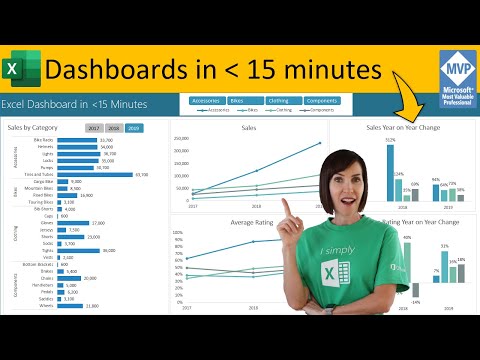
Secrets to Building Excel Dashboards in Under 15 Minutes & UPDATES with 1 CLICK!
 0:36:03
Excel Dashboard Course #11- Introduction to Excel Charting
 0:26:45
Excel Dashboard Course #10 - Excel Interactive Controls (Scrollbar, Spin Button, Checkbox, Combobox)
 0:21:35
Excel Dashboard Course #3 - Excel Tables in Dashboards
 0:00:13
Serial Number in excel shortcut || Automatic serial Number in Excel
 10:37:59
Master Excel Pivot Tables, Excel Slicers and Interactive Excel Dashboards - FULL COURSE!
 0:01:00
Gantt Chart in Excel | 60 Seconds Tutorial #shorts
 0:30:37
How to build Dynamic & Interactive Dashboard in EXCEL with Pivot Tables&Charts | Tutorial Ep...
 0:00:41
Top Excel courses for Data Analysts 🧑🎓📊
 0:09:51
12 Dashboard design tips for better data visualization
 0:00:48
Combine Multiple Excel Files into one! #shorts
 0:00:16
How to calculate PERCENTAGE in excel? | Percentage Formula #shorts #excel
 0:00:20
Excel IF function trick ( In 20 seconds)| Pass/Fail #shorts #exceltricks
 0:01:00
VLOOKUP function in Excel explained in 60 Seconds
 0:06:13
Excel Dashboard Course #2 - Using Camera Tool For Excel Dashboards
Комментарии