filmov
tv
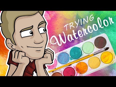
Trying out this new watercolour set from Paul Rubens

Показать описание
Since I made this film Paul Rubens has offered 10% OFF Paul Rubens YouLan Artist Watercolor Paint Set only until 12 May 2024 :
Code: 4JPOR277
Start Date: 2024-5-6
Expiration Date: 2024-5-12
They also added - please note that your Australian subscribers can purchase our products through Aliexpress. We do not offer additional discount codes because the Aliexpress page already has a discount.
This is a new artist quality pan set from Paul Rubens with some interesting pigments to tempt you. I have used it for a couple of weeks now, as part of the Sktchy 30Faces30Days challenge, so I feel I have put it through its paces. I will swatch out the colours and show you a few paintings before reaching a few conclusions.
In a nutshell, I really like it. There are some rarer colours here. I felt it would have benefited from cobalt blue and could have lost the Naples Yellow or May Green. I liked the packaging and it is a classic design. The downside is the lack of open stock (don't think I mentioned that in the film), so you will have to replace with other brands as you use up your favourites. If you are looking for an artist quality set at a good price point, it is definitely worth a go.
I also try out the sparkly watercolour paper - I'm at a bit of a loss as to why you would want this, but in case you are into sparkles it performed well for wet in wet and glazing, but not for lifting. Again since I made this film @amypanddirtytoo1926 shared this information:
It is the alum sizing. Rice papers sized with alum will called "sparkle dragon cloud paper" or the very thin translucent ones "cicada wing" since cicada wings are thin and sparkly. I have many different variations of sparkle paper. I also buy alum myself to size inexpensive rice papers for studies so I can save the expensive good ones for finished works. Sizing is important for the Gong Bi and Chinoiserie I do. And it is important depending on what effect I'm going for when I do Chinese brush painting/Japanese sumi-e. Eastern watercolor isn't meant to be done like Western so of course you would not be able to lift well. That is also why Eastern watercolors, like Kuretake, Kissoh, Choosing Keeping, Komarebi, etc are so extremely pigmented and thick: they are meant to be used in one layer at one go. Meeden, a Chinese company as well as Paul Reubens, another Chinese brand, have used alum to size certain papers so they can also have a range of "sparkle papers".
Thank you @amypanddirtytoo1926
This is what Paul Rubens say:
More Advanced Colors: YouLan Artist Watercolor Paint Set features a new colour palette that is more sophisticated and smooth compared to the fresh colours of Paul Rubens' fourth-generation tube watercolors.
Vibrant Colors and Excellent Solubility: They dissolve quickly on contact with water, resulting in even and uniform colors.
Fine Color Powder and Ultra-Pure Pigments: The ultra-fine pigments are meticulously ground using extra-fine gum Arabic.
Every week I share a tip, trick or technique I wish I had known when I started painting, so if you enjoyed this please like, comment and subscribe. Or if you have a watercolour problem, let me know and maybe I can help?
#lizchaderton #paulrubens #youlan
Excellent Diffusion and High Transparency:The colors blend naturally and evenly, with better diffusion than previous Paul Rubens artist watercolors. The transparency is higher, and the spread of watermarks is more uniform.
Exquisite and Portable Packaging Design: The set comes in an exquisite and portable tin case, making it suitable for outdoor painting and gifting during festivals.
 0:01:00
Trying out Dr. Martin's Concentrated Watercolors
 0:01:00
Testing the Super Vision Watercolor Set
 0:15:04
FIRST TIME Trying WATERCOLORS?!
 0:14:16
Testing 100+ Year Old Watercolor Paint..(& trying to paint with it lol)
 0:01:00
I tried out Etchr Labs Hot Press Watercolour Pad & it Wasn't as Smooth as Saul Goodman (But...
 0:01:00
Trying Out Mr. Clean's 'Magic Eraser' to Fix Watercolor Mistakes
 0:01:00
I Tried Painting Ke Huy Quan with a $20 Watercolor Set by @miyaarts
 0:10:13
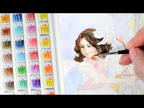
Trying a new Watercolor Set
 0:09:01
SWATCHING ROSA GALLERY WATERCOLOUR ✨ My first Urban Sketchers Event + Sketchbook Time
 0:21:54
Trying White Nights Watercolor Paints by St Petersburg
 0:14:10
Testing Affordable Beginner Watercolour Palettes From Amazon!
 0:01:00
Comparing Travel Watercolor Kits Student (Cotman) vs Professional
 0:10:23
Testing 5 Watercolor Sets under 5 Dollars! Watercolor Sets to the Test!
 0:01:01
if you suck at watercolor, try this👉(part 6)#shorts
 0:18:36
I Tried All the Watercolors and These 7 Are the Best!
 0:01:00
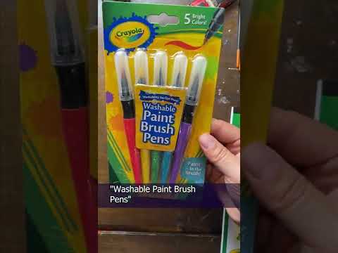
Trying Out @CrayolaLLC Washable Paint Pens and Watercolor Crayons
 0:48:11
Discover my KURETAKE GRAPHITE paint set and GOLD - and create watercolor and pen DOODLES with me!
 0:22:02
$4 VS $300 - TRYING CRAYOLA'S WATERCOLOR SET
 0:01:00
Painting Ariel from the Little Mermaid with @grabieofficial 50 color Watercolor Set
 0:14:20
Best Watercolor Art Wins $5,000!
 0:18:38
UNBOXING & TESTING etchr watercolor set, pen and paper
 0:10:26
Watercoloring a Masculine Card, Trying out new watercolors (Mijello Mission Gold)
 0:01:00
Testing @ohuhuart_official Mix Media Sketchbook with Acrylics, Watercolors, and Pencils
 0:09:54
Testing EVERY GOLD Metallic Watercolor Paint I Could Find
Комментарии