filmov
tv
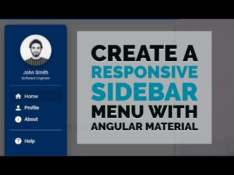
Angular Responsive Sidebar Menu Navigation (EASY)

Показать описание
Hey Ninjas!
Welcome back to Front End Ninja! In today's video, we're diving into Angular to create a responsive sidebar menu navigation that's both stylish and functional. This tutorial is designed to be beginner-friendly, making it perfect for anyone looking to enhance their front-end skills with Angular.
In This Video:
Project Setup: We'll start by setting up a new Angular project.
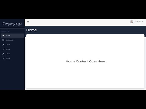
Sidebar Creation: Learn how to build a sidebar menu from scratch.
Responsiveness: Ensure your sidebar adapts to different screen sizes.
Toggle Mechanism: Implement functionality to show and hide the sidebar.
Styling & Animations: Add some flair with CSS animations and transitions.
Best Practices: Tips to keep your code clean and maintainable.
Why This Tutorial?
Creating a responsive sidebar navigation is a fundamental skill for any front-end developer. This tutorial breaks down each step in an easy-to-follow manner, ensuring you can implement this feature in your own projects with confidence.
Time Stamps:
0:00 Introduction
1:10 Angular Project Setup
3:20 Creating the Sidebar Component
7:00 Making the Sidebar Responsive
11:15 Adding Toggle Functionality
14:50 Styling and Animations
17:40 Final Review and Tips
19:00 Conclusion
Useful Links:
GitHub Code (Clone the repo with all the code)
Angular CLI Documentation (Get familiar with Angular CLI)
Make sure to like this video, subscribe to Front End Ninja, and hit the bell icon so you never miss an update. Your support helps me create more tutorials like this one!
Got any questions or feedback? Leave a comment below, and let's get the conversation started.
Keep coding, and stay sharp, ninjas! 🥷✨
 0:00:22
 0:28:29
 0:21:23
 0:12:18
 0:00:45
 0:41:19
 0:35:00
 0:13:00
 0:09:14
 0:37:30
 0:30:08
 0:08:07
 0:16:13
 0:24:56
 0:34:38
 0:22:21
 0:21:44
 0:23:09
 0:00:33
 0:19:11
 0:51:14
 0:38:19
 0:15:21
 0:40:39