filmov
tv
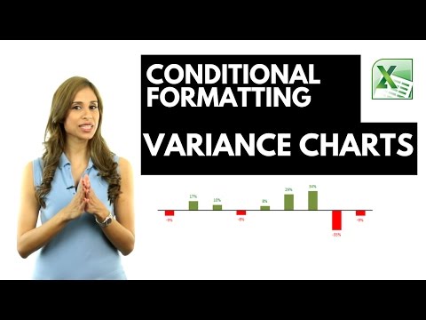
Excel Variance Charts: Actual to Previous Year or Budget Comparisons

Показать описание
Discover how to create dynamic column charts in Excel that automatically update colors based on data changes. This tutorial is perfect for anyone looking to enhance their Excel skills, especially in visually representing sales data. Here's a quick overview of what you'll learn:
Dynamic Color Coding: Learn how to set up Excel so that positive changes in data are shown in green and negative changes in red, without manually coloring each data point.
Synchronized Sales Data Charts: Find out how to display actual sales data alongside the change from the previous year, with both charts perfectly aligned for easy comparison.
Step-by-Step Guide: Follow clear, easy steps to set up your charts from scratch, including removing unnecessary elements for a clean, professional look.
Colorful Data Labels: Not just the bars, but also learn how to change the color of the data labels based on their position relative to the axis.
Conditional Formatting of Charts: Master the art of conditional formatting within charts to make your data more insightful and visually appealing.
Custom Number Formatting: Dive into custom number formatting to control the display and color of your numbers directly in Excel cells.
Practical Examples: Watch as we demonstrate these techniques using actual sales data, making it easier for you to apply these skills in real-world scenarios.
In this video I show you how you can use conditional formatting in Excel Column or Excel Bar charts.
I also show you how you can conditionally format the data labels in Excel graphs to show a different color if the values are positive to when the values are negative.
The technique in the video shows a variance column chart but it works in the same way for a bar chart.
This technique works for Excel 2010, Excel 2013 and Excel 2016. For Excel 2007 and below, you need to use a different technique. You will need to create two additional series, one for positive number and another for negative numbers and format each series accordingly - and also overlap these by 100%.
🚩Let’s connect on social:
Note: This description contains affiliate links, which means at no additional cost to you, we will receive a small commission if you make a purchase using the links. This helps support the channel and allows us to continue to make videos like this. Thank you for your support!
#excel
 0:14:18
Excel Variance Charts: Actual to Previous Year or Budget Comparisons
 0:12:27
How to Create Variance Charts in Excel with Percentage Change (simple & uncommon technique)
 0:01:31
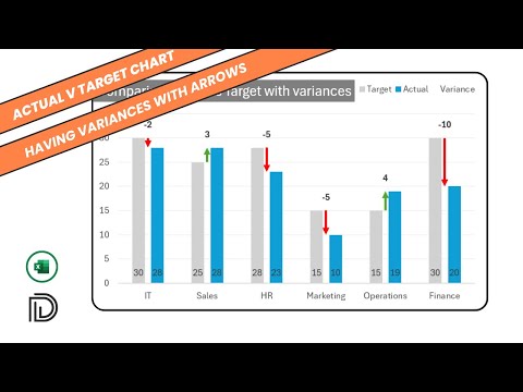
Actual vs Target Charts in Excel: How to make variance charts in Excel with floating markers or bars
 0:04:26
Budget vs actuals chart in Excel with variance
 0:12:22
Excel Variance Charts
 0:14:22
How to Create Variance Arrows with Actual and Target Columns Chart in Excel?
 0:13:49
Bar chart with differences in Excel
 0:02:16
Actual vs Target Variance Charts in Excel with floating bars
 0:01:02
Excel Variance Charts: Actual to Previous Year or Budget Comparisons
 0:00:59
Variance Chart In Excel
 0:10:20
How to Create Dynamic Variance Charts with Arrows | Show Change to Previous Year / Budget
 0:00:51
Actual vs Target Charts in Excel: How to make variance charts in Excel with floating markers or bars
 0:08:59
Budgeted, Actual and variance data all in one chart - part 2 vertical
 0:04:36
Create Budget Vs Actual Variance Chart In Excel
 0:17:35
6 advanced Excel charts that show variance in financial reporting
 0:00:24
Actual Vs Target Chart in Excel How to create variance chart in excel with floating Bars
 0:00:58
Excel Tips 31 - Create Variance Chart | Sobanan Knowledge Sharing
 0:05:51
008. Excel Variance Charts: Labels and Bars changing color automatically! Version 1
 0:07:05
Actual vs Budget Chart with Variance Analysis with Emoji Indicators 🟢🔴👍
 0:02:46
How to Create Variance Column Bar with Negative and Positive Impact
 0:05:29
How to present Actual, Target and Variance in single chart in Excel
 0:03:48
How to create a clean looking variance chart in Excel
 0:10:23
Show Percentage Change (Increase & Decrease) in Column Chart | Show Variance in Excel Chart
 0:14:48
How to Create a Variance Arrows with Actual Columns and Vertical Target Line Chart?
Комментарии