The Basic Elements of Design | FREE COURSE

preview_player
Показать описание

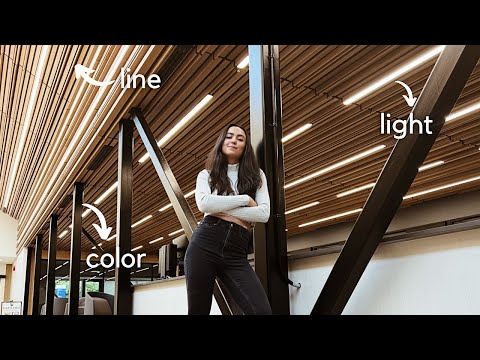
The basic elements of design are line, color, shape, form, value, space, and texture. In this course, Laura Keung will explain how to use each of them to improve your designs. Here's a breakdown of what we'll cover:

00:00 Introduction
01:11 Lines
03:45 Shape
05:40 Form
07:40 Space
10:28 Colour
13:39 Value
15:30 Texture
17:30 Conclusion

Assets Used in This Video:

- - - - - - - - - - - - - - - - - - - - - - - - - - - - - - - - - - - - - - -
Envato Tuts+

Envato Elements
All the creative assets you need under one subscription. Customize your project by adding unique photos, fonts, graphics, and themes.

- - - - - - - - - - - - - - - - - - - - - - - - - - - - - - - - - - - - - - -
Рекомендации по теме
Комментарии
Автор

1. Line :
- fluid line give movement, straight line give structure
- thick line strong, thin line elegent
2. Shape, cqn be used to define boundaries
- Geometry : rules and structure
- Organic : natural flow
- Abstrak : representing something
3. Form : interaction between ahape and space, can be used to balance between positive and negative space
4. Space : compotition between negative & positive space
5. Color :
- hue : the true colod
- shade : give depth
- waves : white element that give more depth & dimensions
- tone : grey, make color more muted.
- saturation : purity level of a color
6. Value : lightness or darkness of the hue, can be used to gives contrast
7. Texture : gives character

Jhonnywck
Автор

I studied Graphic Design 25 years ago in another country and another language. This video refreshed the concepts I learned a long time ago.

mercedesarmstrong
Автор

this is actually soo very helpful i now understand how people make creative icons and art and stuff omgggg now that i know this i feel more creative now

thestoryof__
Автор

Love from India❤️ you are educating a lot here.

JeswinStaynes
Автор

Is there a difference between principles of Design and Elements of Design. Fundamentals of Design Your videos. Please Explain because I'm confused 😕.

jdxaofficial
Автор

Thank you for all you videos, I would love a video “this is bad, this would make it better because” type video, if you’re looking for ideas.

MikeA
Автор

Can someone explain? I don't understand what she means by the lines are being used to cut the direction of the image

VaultGirl
Автор

This is really incredible, looking forward to taking the course.

sehemunzuri
Автор

as a digital artist, im very much confused with the way you explain the use of colour here (10:51). let me explain myself.
you say that shadow is when you add black to a colour to make it darker. but it is definitely a wrong definition. shadow is 'a dark area or shape produced by a body coming between rays of light and surface'. it's definitely darker than the main colour, but it's nothing about adding black to it. in every artschool teachers would say billion times that it's wrong to add black in order to make a shadow, because it would make your picture look dirty. in nature as well as in design/art light and shadow have quite a sophisticated relationship, that is for sure NOT 'just adding black or white'. the right way to create a shadow is to add the opposite colour (to the main one). if the main colour is blue, than the shadow is warmer, a purple one, bc the opposite colour is somewhat orange. moreover, it's clear that in the first picture in 'colour' part (the blue one) there's a very pretty gradient from blue to more saturated darker blue and only then to dark purple. the design wouldn't look as great if the author simply added black to the shadows. that's why this design is amazing, the author knows exactly what they're doing. and im not sure if you know what youre talking about in the part about colours? same here with two other designs, next ones. you cannot just add white to a colour and get a pretty picture. there's also a gradient with a different colour (warm pinkish one that is between purple and 'white'). this pink is what really makes it work. regarding grey, you're also not quite right. it's true that adding grey mutes colours, but the situation is a bit different in the picture you show when talking about grey. the areas that you've highlighted do not show the same effect. in the top right area there's no grey really, if you look closely, it's just a bit darker and more saturated blue, not grey. in the top left area there's a big contrast between bright pink and dark greyish colour. it's true that there's grey here but it's really important that the colour is much darker than the pink one, it allows to create contrast that is essential to balance things out. these details are crucial, because if the designer just added grey, the picture would look dirty and not as pleasant.
it's not the way colours work in design. your information about colours is very misleading, i don't understand why you try to explain it to people if it's just wrong :( im sure you're a good professional but why do you try to explain such concepts if you don't quite understand them

vvcomi
Автор

Thank you so muchh!!! Really needed it ♥️ soo good and beneficial!!!!

beexpressed
Автор

3:57 What does organic mean - shouldn't it be "authentic"? Well English is not my native language, so there are some words that I'm confused about. I really wish someone could explain that to me. I would be grateful.

sara.space
Автор

can't wait, you guys are always a plus

floriankausche
Автор

Which program are you using ? Power point ??

Amel._.
Автор

Another great video. 👍
Question. You said know the color space you need to use before designing. But what if I’m designing a book cover’s ebook and print cover? Design in RGB and export the RGB then convert to CMYK and export the CMYK?

element-alchemist
Автор

what program do you use for designing?

yusufsavm
Автор

Extremely helpful! Thank you soooo much!

rickhoward
Автор

she is very nice good teacher, l really learnt a lot from her. Thank you very much madam, have a blessed day
😎 also teach us about internal illustrator

oscarakchannel
Автор

Please Envato add FRENCH subtitles to this playlist.🙏❤️

AbdoulSalamAbdoullah
Автор

I am confused in forms, combination of shapes are called forms right ? Space and forms are different am i right? Space has positive and negative but form is something combination of elements which create a new structure for example Icecream, pyramid, water bottle when we reverse engineer thay it is combination of cylinders, triangle and square .

beatvtv
Автор

How can you keep clients out of the negative space?

dasfabelwesen
welcome to shbcf.ru