filmov
tv
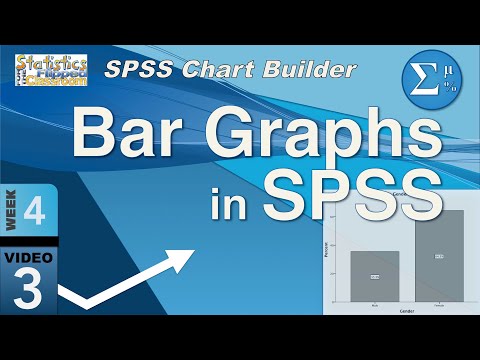
Bar Graphs in SPSS using the Chart Builder (4-3)

Показать описание
The first graph we will learn about is called a bar graph. Bar Graphs are a great way to show categorical data. When you have two or more groups and a specific number of participants in each group, the bar graph can show us numbers and percentages. It is simple, elegant, and eminently useful. Bar graphs are typically used with categorical data (nominal and ordinal) and histograms are used with scale data.
This video teaches the following concepts and techniques:
SPSS Chart Builder bar charts
Table of Contents:
00:31 - Bar Graphs
01:51 - Bar Graph in SPSS
This video teaches the following concepts and techniques:
SPSS Chart Builder bar charts
Table of Contents:
00:31 - Bar Graphs
01:51 - Bar Graph in SPSS
 0:07:04
Creating Bar Charts in SPSS
 0:04:04
How to Create a Bar Chart in SPSS - Bar Graph
 0:06:41
Bar Graphs in SPSS using the Chart Builder (4-3)
 0:04:13
Bar Charts in IBM SPSS
 0:04:31
SPSS Explore Data / How to Create a Clustered Bar Chart for Many Categorical Variables
 0:11:37
MASTERING SPSS - DATA VISUALIZATION WITH SPSS | BAR CHART, PIE CHART, HISTOGRAM, BOXPLOT, ETC
 0:02:36
SPSS: Bar Graphs
 0:03:20
SPSS: Stacked Relative Bar Chart of multiple variables
 1:23:31
Day-8 Application of SPSS for Data Analysis (Quantitative Data Analysis)
 0:04:37
Create Bar Graphs on SPSS (Between-Group Designs)
 0:09:06
SPSSisFun: Creating Bar Graphs using the Chart Builder function
 0:02:06
Clustered Bar Graphs in SPSS
 0:05:03
Ordered Bar Chart Based on Statistic - SPSS
 0:03:03
Frequency Tables and Bar Graphs in SPSS
 0:02:26
SPSS - Stacked bar chart (via Chart Builder)
 0:02:22
SPSS - Simple Bar chart (via Chart builder)
 0:01:27
SPSS BarChart ModifyLabels
 0:12:07
Pie Charts, Bar Graphs and Histograms in SPSS
 0:10:01
How to Jazz up your SPSS graphs in Excel for your thesis
 0:07:56
Statistics for Research - L9 - Charts and Graphs using SPSS
 0:02:03
SPSS - Simple Bar chart (via Frequencies)
 0:03:08
SPSS - Stacked Bar chart (via Legacy)
 0:01:54
Bar Graph in SPSS split by nominal variable
 0:14:32
SPSS Tutorial: Graphs, charts, and plots
Комментарии