filmov
tv
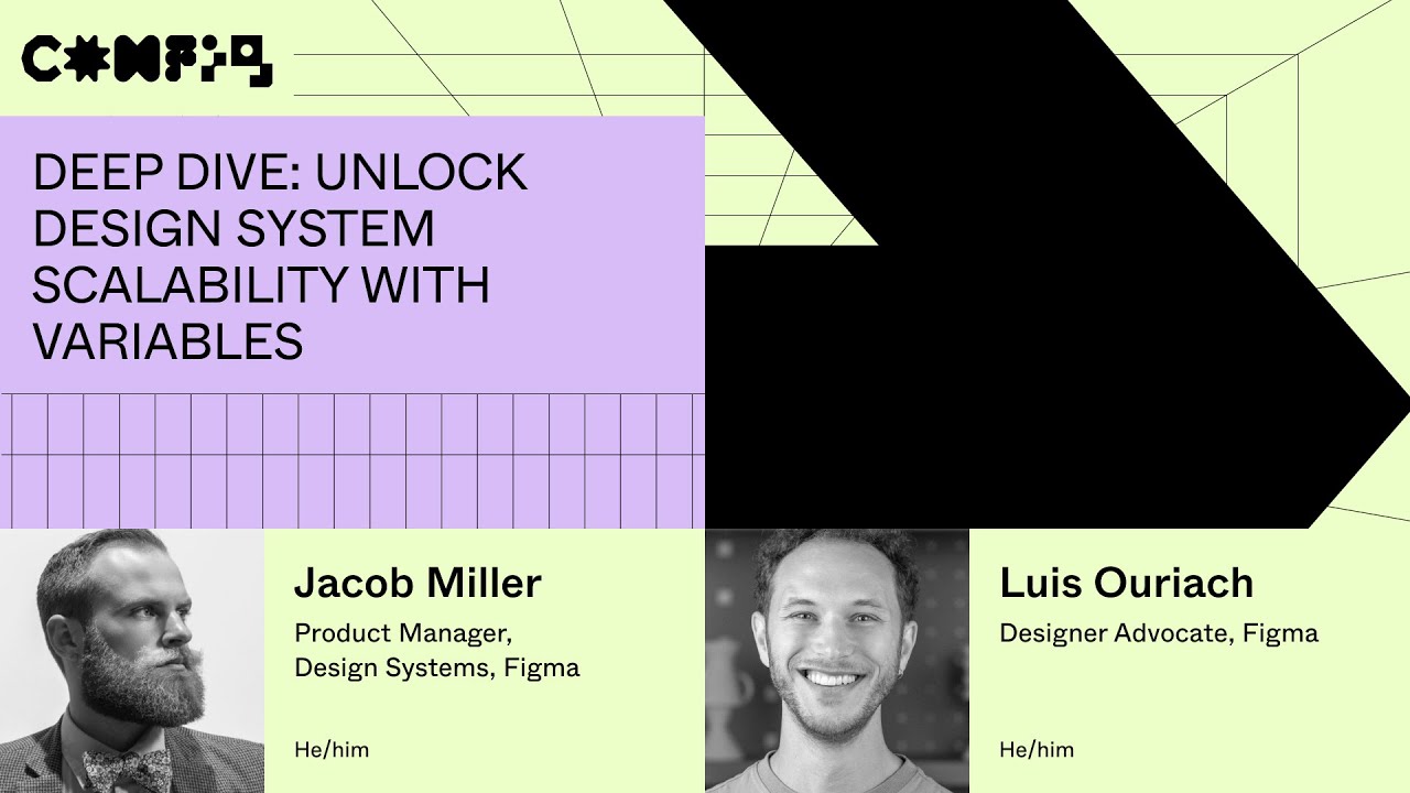
Deep Dive: unlock design system scalability with variables - Luis Ouriach, Jacob Miller(Config 2023)
Показать описание
Speakers:
Luis Ouriach – Designer Advocate, Figma
Jacob Miller – Product Manager, Design Systems, Figma
Join us for an in depth session to learn how you can level up your design system in Figma for better scalability, theming, and more using variables.
____________________________________________________
Find us on ⬇️
____________________________________________________
#Figma #Config #FigJam #Tutorial #NothingGreatIsMadeAlone #design #tips #DesignSystems #Config2023
 0:47:03
Deep Dive: unlock design system scalability with variables - Luis Ouriach, Jacob Miller(Config 2023)
 0:23:56
6 Advanced UI Design Tips (Deep-dive)
 0:09:33
End-to-end UX/UI Design Masterclass Course
 0:00:50
Unlock the Power of Design Systems: Inspiration from the UK Government
 0:51:25
Designer and developer workflows unlocked using Dev Mode - Jake A, Avantika G, Lauren A, Jenny L
 0:33:12
Creating multi-channel multi-theme connected libraries in Figma - Jack M Andreamorgan M, Ryan L
 0:00:15
What are friends for! #thehamiltoncollection #bugatti #laferrari
 0:41:49
AI and the future of design: Designing with AI - Noah L, Jordan S, Andrew P, Vincent van der Meulen
 0:16:44
Unlock Your Tech Future: Why Study IB Computer Science?
 0:45:54
Driving change with design systems and process - Matt Gottschalk, Aletheia Délivré (Config 2023)
 0:54:15
From monologues to dialogues—unlocking designer-developer collaboration - Maria H,Som L(Config 2023)...
 0:43:54
Design systems and Figma strategies - Joey Banks (Dive Club S1 | E1)
 0:46:57
Creating Effective Design Systems
 0:02:39
5 STRANGE Rules You MUST FOLLOW If You Buy Rolls Royce
 0:41:49
A glimpse of the future of design tooling - Dan LaCivita (Dive Club S7 | E1)
 1:01:38
Making Accessible Design Systems with Ashlae Nelms | Some Antics
 0:00:47
Variables Teaser (Config 2023)
 0:07:11
Figma in 5: Design Systems: Components
 0:00:59
System Design | Caching Deep Dive: 4 Pillars of Peak Performance
 2:12:37
2021 Lexus LS Full Tutorial - Deep DIve
 0:16:07
Unveiling The iPhone 15 : A Deep Dive
 0:01:00
Biggest Mistake UX Designers Make!
 0:12:18
Deep Dive- Subaru Infotainment System
 0:39:13
The Basics Of Design Systems Explained With Luis Ouriach From @Figma
Комментарии