Think XFCE looks bad? Think again! - XFCE Customization

preview_player
Показать описание

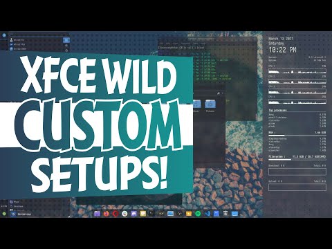
For as long as I've used Linux, I've heard, and thought, that XFCE was a "bad looking desktop". While my first contact with it didn't really change my mind, it's time to take a look at how to change its look and feel, and hopefully get rid of that preconceived notion. We'll start with a few examples of changes applied to XFCE by some distros, and then we'll try to build our own look and feel.

Become a channel member to get access to a weekly patroncast and vote on the next topics I'll cover:

Support the channel on Patreon:

Ok, so let's start with something that's really close to the default: Xubuntu. Xubuntu doesn't change much from the default XFCE layout: they keep the top bar mostly intact, and they remove the bottom panel with its quick launchers.

They swapped out the default XFCE Menu for something people have been recommending quite a lot: the Whisker menu. When you right click it, you get access to a LOT of options to really make it your own: you can display apps as icons instead of lists, elect to show the "generic app names".

On top of that, the whisker menu lets you change where the category list is displayed, where the search field goes, and a lot more.

Apart from that, Xubuntu doesn't change much: the default theme is Greybird, and the default icons are the elementary XFCE ones.
For a good close to vanilla XFCE experience Xubuntu seems perfect, but that's not what we're looking for here.

Let's move on to Linux Mint. Mint tweaks their XFCE implementation to look and feel exactly like Cinnamon, their main desktop, and it's quite nice.

They basically move the top panel to the bottom, in a more windows-like layout, and they also use the whisker menu, which apparently you can resize. Mint also got rid of that second panel that default XFCE ships, to integrate its features in the main one, namely the quick launchers.

The rest of the layout is pretty much bog standard, with the window list, and the system tray applets.

In terms of look and feel, Mint brings its own green appearance, with the Mint-Y, or Minty GTK theme and icons, and going over to the Ubuntu fonts instead of the Noto family.
Still, that's a simple customization effort, it's basically a new theme for everything, and flipping the top panel to the bottom. We can go further than that.

## Pick and choose

This is Enso OS, and honestly, if you had told me it was based on XFCE, I just wouldn't have believed you initially.

The layout is nice: you have a dock, and a top panel with a global menu. On top of that, you get the regular system tray applets, but with a better calendar than the default.

The bottom panel isn't an XFCE panel at all, it's the Plank dock, aligned to the left of the screen. It hosts an application launcher that looks pretty cool and can be invoked with the "super" key, a "multitasking" icon that opens the multitasking view that elementary OS users will be familiar with, and there are also some quick launch shortcuts.

Speaking of elementary OS, Enso OS uses their window manager, which means that you also get animations when minimizing, maximizing, and tiling windows. It looks pretty good.

Enso OS also changes the theme for their own, the icons using the "Paper" theme, and uses the Ubuntu fonts, and the Breeze cursor theme that KDE Plasma created.

## My own results

So, I moved the panel to the left. I added Whisker menu, and configured it to be pretty much just an applications list: I only use the menu as a search engine, and as such I don't need fancy icons or categories, just a nice list of apps.

Then it's a separator in expanded mode, and pretty much the standard notification applets, clock, and logout menu.

On the bottom left, I used Plank, the dock elementary OS uses, because it's fast, it's super simple, and it handles window management. I decided to go without a border around icons, and to group everything on the left, to make mouse operations easier.

The theme I used is called Qogir, for the GTK theme, the window borders and the icons, I think it looks quite good, and I already use it as a backup theme for GTK apps on my KDE desktop.

I moved all window buttons to the left, except for the maximize one, because I like trying new stuff out, and I changed the font to Inter, because it's a lot more professional looking than Noto in my opinion.
Рекомендации по теме
Комментарии
Автор

Much as I dislike ads, I love the "let's pay the bills" line.

christopherlewis
Автор

xfce is super customizable and can look amazing all while still being one of the most lightweight DEs. Don't let the default look fool you.

zerotheory
Автор

"Linux Mint tweaks their xfce desktop to look and feel like cinnamon, their main desktop"
Actually they ran XFCE like this long before cinnamon was even being thought of. Heck this is how it looked back on Gnome 2.x as well. They pretty much kept it like this with Gnome, KDE, and XFCE in those days.

experimental
Автор

I don't think XFCE looks bad in the first place. Beyond the basic good looks, I don't demand super flashy or beautiful desktop environment, cos all those effects and beauty come at a cost - usage of more resources. But then again, for most people that's not an issue. I personally like to keep my computer's resource usage low even if I have high specs. Beyond a basic level of beauty that makes working on my computer pleasant, I don't want more. I don't switch on my computer to stare at the beauty of the OS, but to just get work done. That's the basic reason anyone buys a computer in the first place.

albussd
Автор

The second XFCE panel is a relic from the era when monitors used to be small, low resolution and 4:3. So you'd need a separate panel for the launchers, so that the top panel wouldn't get crowded and illegible when multiple windows are opened. But with 1080p and 4k screens as well as wide screen monitors, the bottom panel is completely redundant.

NostalgiaforInfinity
Автор

XFCE does a lot of the layout of more heavy desktops significantly better, such as Unity.

phonewithoutquestion
Автор

I love the humor in this video, I literally laughed out out at several points. Great video, as always!

marklemoine
Автор

Can we take a moment to appreciate how awesome the Ubuntu Font Family looks?

hiiaminfi
Автор

Even if I had 128GB RAM, a 32-core Threadripper and two RDNA2 GPUs, I would still be using XFCE. It's not just the familiarity it gives you (because indeed it looks like something out of Windows 2000 SP4) but the lightweight nature. I grew up quite spoiled, and would rather have Linux distros that on Idle don't consume more than 1GB of RAM, especially seeing as my Windows desktop is always idling with over 2GB of RAM in use.
Nowadays I'm experimenting a bit and trying out Deepin, but before this, I had Debian Buster with XFCE and was able to customize it to my liking.
Some people might scoff at the need to tweak a distro's DE from the get-go, but horses for courses, guys.

Team Xfce for life here.

juanignacioaschura
Автор

As far as I know, XFCE is in the process of switching to headerbars. But the dev team is very small so it takes some time. But lot's of the settings and the task manager are already using headerbars. ... It's interesting that a desktop so widely used like XFCE seems to have such a small dev team.

In XFCE I also like the balance between customizabilty and ease of use. When GNOME hasn't enough options and KDE has to much, XFCE is a good choice. One can change the looks without digging through so many settings or to install additional applications.

sbedivere
Автор

I love xfce, especially xubuntu... It perfectly meets my requirement, clean, minimal and lightweight high performance desktop environment.

mahfuzurrahman
Автор

At 6:19, I didn't even realise I was staring at Windows 10. I was like "oooo now this looks like a fresh Linux customisation I can get behind! That file manager looks pro. Wait. The Windows 10 start menu?!"

KentoCommenT
Автор

I'm over here using xfce4 for the last 7 years with Gentoo. It's honestly the best for low end computers.

jimbow
Автор

Zorin Lite has the best XFCE theme yet. If you haven't seen it you're missing out!

neffscape
Автор

your more recent videos are so much better, I wasn't expecting the little sound clips lol I love XFCE

fadedtimes
Автор

Your customized layout look really nice, good freaking job, awesome

Автор

hello do you know about safetly remove usb icon on taskbar xfce4 ? i cannot find it

egjejong
Автор

Perfect timing! I needed this for alpine linux!

Edit: Didn't realize that you were going to talk about distros that use XFCE, my bad!

SaltyNotSweat
Автор

On my 2 screens setup it was impossible to put the primary one on the right. XFCE always wanted the left one to be the primary, so I couldn't really use it when I tried it 2 years ago. Anyone knows if this is fixed yet?

nachocdbz
Автор

One thing that never seems to get mentioned with XFCE is the window manager options, as far as I'm aware its window manager (along with Kwin, Openbox, and Compiz) is the only one that gives you decent placement options, for example I can easily disable raise on click, so then my terminal window won't get sent to the back when I click on firefox to copy some text from a webpage, and if I open 2 terminals or 2 file managers they will be placed side by side, instead of in a cascade placement like all the other modern GTK desktops seem to do these days, its like these modern GTK desktops have gone the Gnome 3 route and removed configuration options, I've tried all these modern GTK desktop environments and while they look nice I simply can't use them due to lack of configuration options, so I stick with XFCE with Compiz (the original 0.8 version of Compiz still seems to be the fastest compositing window manager)

benjy
join shbcf.ru