filmov
tv
Google Maps UI Design Teardown THE BEST UX DESIGN FOR MANAGEMENT MODALS #uidesign #designtutorial

Показать описание
It’s going to happen. If you’re designing a product, you will have to create a management popup. Make the right choice and skip the popup—use sheets instead!
Sheets are so nice to use because users control the user experience. They can swipe down to close, reference the content behind to remember where they are in the flow, pull up to get more details. All while still having lots of room to add management buttons and additional content.
In this video I break down how Google Maps uses sheets and how it fits into material design system. Then we’ll go rebuild Google Maps together in Figma through a follow along Variables, Components, and Prototyping tutorial.
Find me on socials:
------
Chapters:
0:00 Why Sheets are so good
1:07 Google Maps sheets teardown
6:36 How I use sheets
8:25 Recreating Google Maps
17:15 Prototyping, Variables, and Components
You're Rad ❤️
 0:23:28
Google Maps UI Design Teardown THE BEST UX DESIGN FOR MANAGEMENT MODALS #uidesign #designtutorial
 0:05:35
UI Observation- Google Maps App
 0:06:53
world's shortest UI/UX design course
 0:13:22
Google Maps vs Apple Maps!
 0:08:20
Mapbox VS Google Maps
 0:00:44
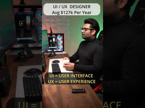
Software Engineer Vs Designer
 0:00:25
what it’s like to work at GOOGLE…
 0:00:23
Pixel 9 Pro XL vs iPhone 15 Pro Max - SPEED TEST!
 0:00:22
Why 'GOOGLE' Is Actually Misspelled 🤔 (EXPLAINED)
 0:00:10
Apple always leaves their products so close to the edge #shorts #appleevent
 0:01:00
E-ink on Android. What could go wrong?
 0:00:30
Preview Tutorial Custom Tooltip Marker Google Maps #Shorts
 0:00:38
Spider Living In My PS5
 0:13:58
The ENTIRE WORLD in 3D inside of UNITY| Google Maps 3D Tiles to Unity TUTORIAL
 0:02:54
How The Pandemic Broke Google Maps (Early 2020)
 0:00:34
Apple Watch Ultra Vs Galaxy Watch #shorts #youtubeshorts
 0:00:32
Ben 10 Omniverse Galaxy Watch App (Randomizer)
 0:00:24
Netflix On Samsung Galaxy Watch #shorts #netflix
 0:29:29
How I Make My Maps
 0:01:00
World’s First REAL AR GLASSES!! - RayNeo X2
 0:15:22
This $150 Smartphone might be All You Need.
 0:00:57
It's a Normal Smartwatch Until...
 0:00:57
My Google Interview Experience
 0:00:58
Pixel Watch 24 Hours Later - Too Small???
Комментарии